Histogram question

Turnerea

TPF Noob!
Joined
Aug 28, 2008
Messages
212
Reaction score
0
Location
SoCal
Can others edit my Photos
Photos OK to edit
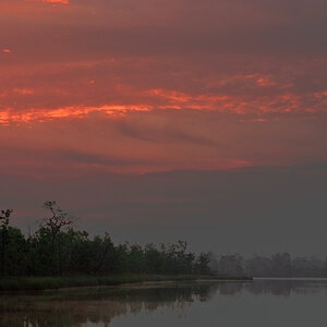
I've got a quick question pertaining to why some of my histograms look the way they do. I understand the basics of what the histogram tells you, but I'm unsure what the following histogram is telling me about this picture:

4050417434_8a89110283_o.png


4049672477_2e19174453_b.jpg


Not that this picture is anything spectacular, just trying to understand why there are the high peaks to the right, which suddenly end, and what they are telling me about the image. What could I do when I see that sort of histogram to improve the image? For this one I'm guessing an grad ND on the water which is corresponding to those peaks?? I have NOT adjusted this image at all- straight from the RAW file.

thanks for any thoughts...

Erik
 
The histogram is telling me that a large portion of the image is very similar, that it falls within the dynamic range and that it's brighter than most of the rest of the image. Looking at the image, it's obvious that the large spike in the histogram is a representation of the sky.

Also, we can see that the histogram doesn't reach either end of the graph, suggesting that there isn't as much contrast as there could be.

What sky :lol: that's the sea isn't it :confused:
 
well it was early in the day, so the transition from sea-->marine layer--> sky is not so clear ;)

Am I thinking too much into this to try and understand why the those spikes to the right fall off so quickly? I understand the low contrast because it doesn't reach fully to either end, but is there anything to be learned from the shape of those spikes? I guess I'm just confused because they look like things that have been clipped, and then 'recovered'. Didn't expect to see such a fast fall off.

thanks
Erik
 
The sharp fall off is just because at the top of the image...the tone becomes practically the same all the way across.

Think about it this way. If you shot an image that was perfectly uniform....the histogram would be a single line from top to bottom. The more tones you have, the more spread out the graph will be.
The histogram for a clear blue sky looks like a telephone pole.
 
If the histogram reached the edges of the ranges, you would have white pixels and black pixels. If you look at the pic, there isn't anything as extreme as that.
 
Understood... thanks for the comments.

Picture is from Torrey Pines.
 
For one the histogram indicates that you need more highlights. Also indicates that the blue channel is dominate. At this point I try and get all the channels to line up. I then take it from there; wether I want the image to have a warmer or cooler tone.

My tech is very unscientific, but it is a good starting point for me. Histograms are the windows to your photograph. Take the time to read the reams of information that is out there.

Love & Bass
 
I disagree.

The histogram is only indicating what the image represents. In this case why would you need more highlights? Look at the image, do you want to start blowing out the sand? You don't need to make it white, and it looks perfectly fine as it is. Also why would you want the channels to line up? I'm sure that blue water was not grey in real life.

A histogram tells it the way it is, but it never ever tells you what you *need* to do to an image.
 

Most reactions

Back
Top