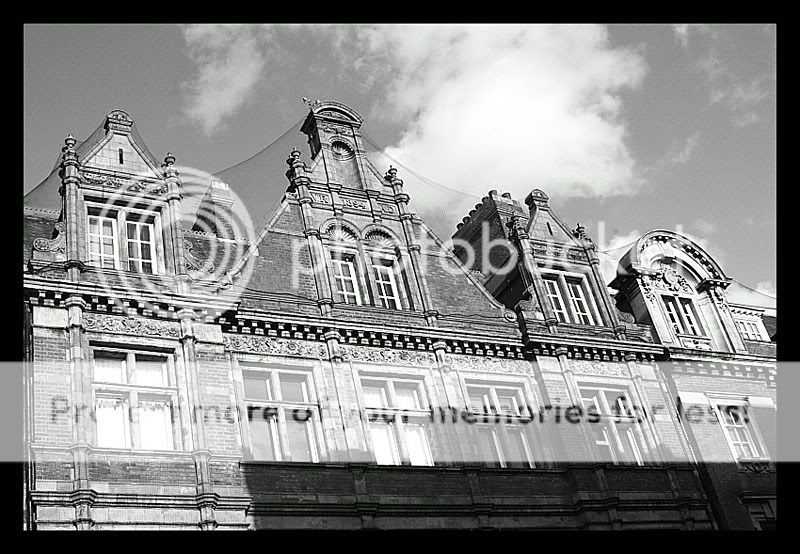
Graelwyn thank you for posting. I too agree that the colour version works due to the strong vivid colours. And the blue sky contrasts nicely to the red brick. I also really like some cloud in these types of pictures as it adds interest to the sky.
Personally I would of processed the B&W picture quite differently. I would of really dropped the luminescence of blues while increasing it for the reds /oranges. This would vastly increase the contrast between the sky and the building as well as the sky and cloud, and IMO make for a more striking image. I would be happy to post an example.


![[No title]](/data/xfmg/thumbnail/37/37491-9a5a4b87cc7adab94e5cc59f2da93701.jpg?1619738112)

![[No title]](/data/xfmg/thumbnail/37/37494-d432dd0601f47668ec55d04f350f243b.jpg?1619738113)