Peanuts
TPF Noob!
- Joined
- Jun 16, 2005
- Messages
- 2,905
- Reaction score
- 85
- Location
- Canada
- Website
- www.brittanyesther.com
- Can others edit my Photos
- Photos NOT OK to edit
Can't thank the two people who replied to my "Interior Photography" thread a few days ago enough. It would have been an even worse disaster otherwise. The overall 'review' of this was that it was a wonderful learning experience in which I learnt plenty of 'to do's and 'not to's. For instance dusting off the furniture is a 'to do', and forgetting to throw on the polarizer is a 'not to'.
Why I am posting these images is essentially to get as much constructive (or just plain brutal if you prefer) criticism. I am hoping to try my hand at this once again, so as much knowledge that I can gain before then would be much appreciated.
Firstly, my apologies for the number of images, as well as for the borders. I generally avoid borders like a plaque, but in this case I thought they needed a 'unifying' touch. (Though for some reason some borders are larger then others)
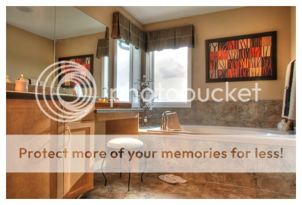
1. My largest self complaint regarding this image is the burnt out curtains. (The image taken by the designer prior to me taking photos is: http://i18.photobucket.com/albums/b118/Peanuts_Schroeder/CalBridgeShowhomesCochraneBradsh-1.jpg)

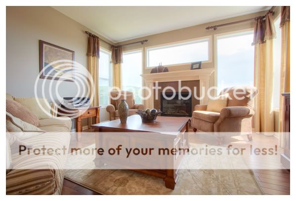
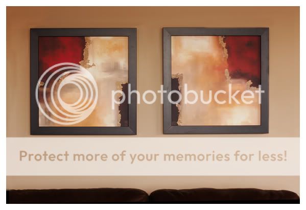
2. My overall goal with this photo was to make the room appear more open and as warm as it appeared in person. (Photo sent: http://i18.photobucket.com/albums/b118/Peanuts_Schroeder/CalBridgeShowhomesCochraneBradshous.jpg) The chromatic abbretion around the windows is somewhat frustrating. Any tips as to how to avoid this in the future? The mat was 'wrinkled' and I was not able to make it entirely flatten out.
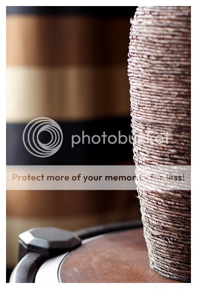
3.
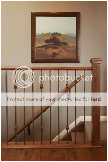
4. Too boring?
5.
6.
7.
8.
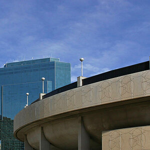
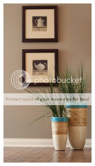
9. Too simplistic?
10.

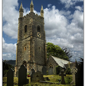
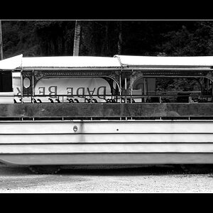
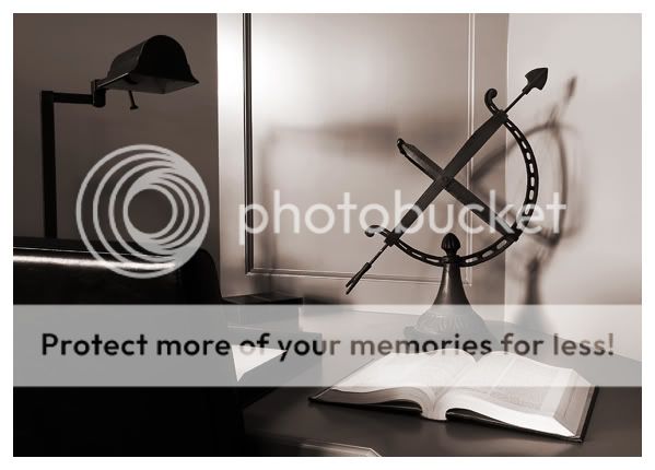
11. I should probably explain that the focus was intended to fall on the 'D' and then taper off, but I wasn't able to move back far enough with the 50mm to achieve this and settled on the 'E'. Any thoughts of whether I should show this particular image or not?

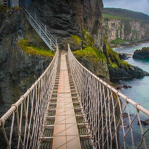
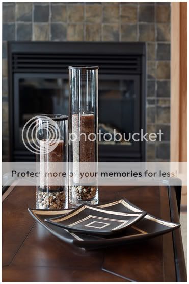
12. Is this too 'HDR' for most people's tastes? Unfortunately I wasn't able to save it otherwise.
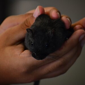
13. Possibly one of my favourite images from the day. Except the basket is splat dab in the middle.

Why I am posting these images is essentially to get as much constructive (or just plain brutal if you prefer) criticism. I am hoping to try my hand at this once again, so as much knowledge that I can gain before then would be much appreciated.
Firstly, my apologies for the number of images, as well as for the borders. I generally avoid borders like a plaque, but in this case I thought they needed a 'unifying' touch. (Though for some reason some borders are larger then others)
1. My largest self complaint regarding this image is the burnt out curtains. (The image taken by the designer prior to me taking photos is: http://i18.photobucket.com/albums/b118/Peanuts_Schroeder/CalBridgeShowhomesCochraneBradsh-1.jpg)
2. My overall goal with this photo was to make the room appear more open and as warm as it appeared in person. (Photo sent: http://i18.photobucket.com/albums/b118/Peanuts_Schroeder/CalBridgeShowhomesCochraneBradshous.jpg) The chromatic abbretion around the windows is somewhat frustrating. Any tips as to how to avoid this in the future? The mat was 'wrinkled' and I was not able to make it entirely flatten out.
3.
4. Too boring?
5.
6.
7.
8.
9. Too simplistic?
10.
11. I should probably explain that the focus was intended to fall on the 'D' and then taper off, but I wasn't able to move back far enough with the 50mm to achieve this and settled on the 'E'. Any thoughts of whether I should show this particular image or not?
12. Is this too 'HDR' for most people's tastes? Unfortunately I wasn't able to save it otherwise.
13. Possibly one of my favourite images from the day. Except the basket is splat dab in the middle.
")

![[No title]](/data/xfmg/thumbnail/33/33447-c3f5563c9b8b1f19498a3062f60f92b1.jpg?1619735973)