John_05
TPF Noob!
- Joined
- Nov 26, 2005
- Messages
- 523
- Reaction score
- 4
- Can others edit my Photos
- Photos NOT OK to edit
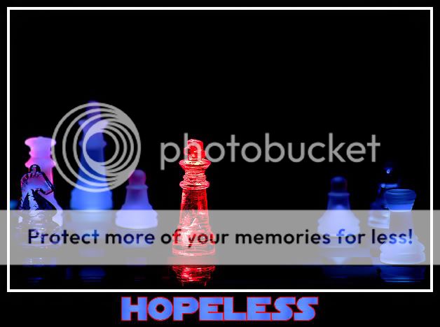
while going through some photos a friend of mine shot, he showed me one he titled "Hopeless". it really was an amazing photo. it showed a friend of his sitting on a rock with his elbow on his knee and his chin resting on his hand near a slightly flooded creek. it looked like he was desperate to get to the other side but with the water being too deep and running too fast, he had a hopeless look about him.
any time i express that much interest in one of his "themed" photos, he encourages me to try my own type of shot along the same theme. after a couple days trying to think of a scenario that would fit a hopeless theme, i came up with this.
i have a couple fairly specific questions regarding the picture.
1, i was wondering if anyone else sees the "hopelesness" in the shot.
2, does the red light hitting the other pieces on the left throw it off, or does it look ok like that?
3, would it look better with a shallower DOF?
4, would it look better if the board was showing more?
5, should i reshoot it with the king turned so its facing directly toward the front, or does the angle look ok?
i still have the board and pieces set up, so reshooting it isnt much of a problem. the only post processing i did with this shot was to clone out a piece that was sitting behind the king, but barely visable. i also increased the contrast a small amount and cropped a very small amount off the right and the top to retain the original aspect ratio, and to give it a more centered look.
i used a remote for the shot, and illuminated the king with a laser pointer, and painted the rest of the board with an LED to get that effect.
thanks for any critique and advice anyone can offer.
") I'd say the only improvement would be to try and keep the blue pieces all blue, the slight red on the left doesn't look right. Also I'm not a fan of the font used but thats personnal preference
I'd say the only improvement would be to try and keep the blue pieces all blue, the slight red on the left doesn't look right. Also I'm not a fan of the font used but thats personnal preference 
![[No title]](/data/xfmg/thumbnail/38/38738-7933157d1b8968c986eeeab2d1828524.jpg?1619738703)
![[No title]](/data/xfmg/thumbnail/31/31746-12607d714ca2713b95250821c881aea9.jpg?1619734987)