kahulani
TPF Noob!
- Joined
- Oct 29, 2009
- Messages
- 27
- Reaction score
- 0
- Website
- www.mangohillphotography.com
- Can others edit my Photos
- Photos OK to edit
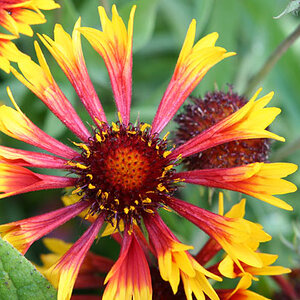
I know this probably has major exposure problems, but I am trying to make this pop. Anyone wanna give it a shot or give me some advice in order to make this image better? THX!
Last edited:


![[No title]](/data/xfmg/thumbnail/38/38736-5bc266b035e23faf5ad942bdd97466a8.jpg?1619738703)