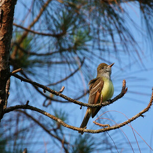
I kike #1... I wish you did not cut off the top of the house... And I think it might benifit from a slight adjustment of the white balance/levels. Maybe its just me, but it looks a bit overexposed.
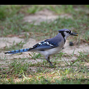
I like these, personally i think 1 and 2 could use a bit of a saturation boost and #3 looks like the WB is off a tad. These could have potential for some decent B&W images