gatorcruz
TPF Noob!
- Joined
- Oct 16, 2008
- Messages
- 16
- Reaction score
- 0
- Can others edit my Photos
- Photos NOT OK to edit
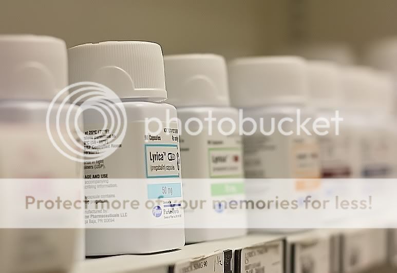
The crop is not a bad idea but flip the the image horizontally so that the focused bottle is to the RIGHT of your screen ... Most people place icons to the left and the bottle may be a distraction if it remains to the left.
Also, you may experiment with keeping only the focal bottle in full color and the rest in b/w ... perhaps it may add a nice alternative effect.
Also, you may experiment with keeping only the focal bottle in full color and the rest in b/w ... perhaps it may add a nice alternative effect.


![[No title]](/data/xfmg/thumbnail/34/34142-948c6bafdf60862125009004d5a06e46.jpg?1619736315)


![[No title]](/data/xfmg/thumbnail/42/42021-ffc326f5dc5b4c65ce53935e6e9e4338.jpg?1619739980)