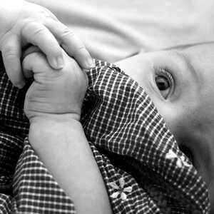
I like the composition, but I think there is a little too much palm on the left. It's a fairly large, flat, undefined section which takes away from the rest of it, where there is a lot of intricate little details, in the little fingers and lines and creases of the hands. I also think I would like it just a teeny bit darker. Other than that, it is really lovely.
I'd crop some off the left side. It seems like there is a large light space there, lacking the texture that fills the rest of the image. It pulls my view away from the child's hand.
It looks like the back of the child's hand (the last finger or so) is edging out of the DOF; not a big deal.
Don't know what it looks like in color. I was "experimenting" (ie fooling around) with our new digicam. I shot this with the built-in sepia filter, then decided it would look better b&w, so I converted in photoshop and adjusted the contrast and levels some.
The sepia version was ok, but the shot needed the extra contrast and I think that works best in b&w.
I might try colorizing it if I have some free time to play.
It seems to be necessary for those with fragile egos. True this photo is completely unoriginal...but what? I can't take a pic of a mountain b/c ansel adams did it first. Besides, you can learn alot by trying to reproduce other pics. It's the best experience. And that's what drlynn is obviously here for.
You, bunkwild, have offered nothing as far as I can tell.


")

![[No title]](/data/xfmg/thumbnail/37/37602-1ef8dbb1c2d0e4ff347ee65d328c3603.jpg?1619738147)
![[No title]](/data/xfmg/thumbnail/37/37604-7ad625e983f92f880eb65a264eeef5e4.jpg?1619738148)