I would like some honest criticism about some pictures I took...

keythsea

TPF Noob!
Joined
Sep 1, 2014
Messages
36
Reaction score
4
Location
Louisville, KY
Can others edit my Photos
Photos OK to edit
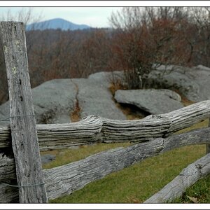
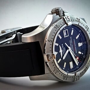
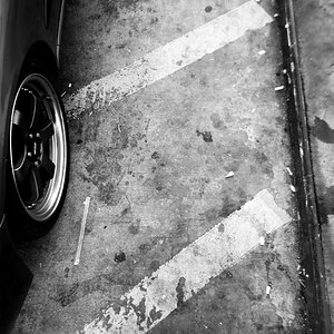
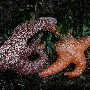
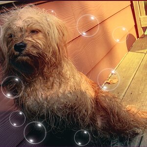
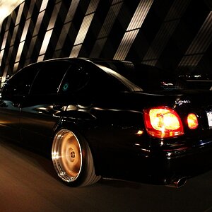
I'm actually using the editing program that came with the camera (Pentax Q10) and I would like to get some tips on editing and composition. Could you take a look at these pictures and tell me what needs to be improved? Thank you in advance.

Abandoned Building 3.jpg Cans.jpg pipes 2 shrunk.jpg Truck color.jpg IMGP0350.jpg
 
Ok let me try and give it a go but as I am also a bit of a newbie I might have it wrong. A bit disappointing overall for people starting out not to get a bit of feedback on their work.

Overall none of them really grab me as being that wow factor.

The wall - I seem to be missing any real story behind this one and find that I am not drawen to any particular point in the photo. Is it the texture of the bricks, the white spot or the windows, not really sure.

The two cans - I just see two cans not much else in this one.

The blue thing - I really have no idea what this is.

The truck - This looks like it had a lot of potential however the crop is incorrect. You should have captured the complete truck here. The background also spoils the effect drawing your eyes away from the subject to what you see in the background.. if you could have positioned it so as to not get the cars in the background in the shot it would have been better.

The blue bin - This falls in the center of your shot so you need to try and remember the two thirds rule with shots like this one.

Hope this helps and keep shooting.
 
5 images, in my opinion, is too many to critique in one sitting. It is for me anyway.


So I'll take image #2 with the cans.

It really looks like you paused and took a picture. It doesn't appear to have any real composition at all. A different angle may have helped a lot (ie get way down low eye level with the cans) and try it to see if it improves.


Also on a related note- if you did pause to take a picture of the litter I do hope you also took a moment to get it to a proper trashcan/recycling bin...
 
Sorry to be blunt, but all of them are very snapshotesque. It's hard to discern what the subject is in a few, and in the ones where the subject is apparent, there is no real substance. It's a picture of a trash bin... or a picture of a truck... or a picture of some cans...
My recommendation... and this helped me a BUNCH... instead of going out taking one picture each of a dozen things you find to be interesting, find one thing and try to take a dozen interesting pictures of it. Spend a lot of time with it.... look at it from every angle... get beside it, under it, on top of it... fill the frame with it... look at parts rather than the whole... etc. Then post your favorite one of the bunch here and let folks have a go at it.
Just a thought. Thanks for sharing!
 
A reallllly valuable piece of advice above, about trying to take a dozen interesting photos of each subject, as a way to improve your "seeing" skills and your compositional skills. I agree with Stradawhovious, the above photos are somewhat snapshotesque. I do think the trash dumpster shot though, is more of a formal, studied small-scale urban landscape shot though; there was some thought put into that, or so it seems. No matter what "we say", keep on shooting, keep on learning to see the way a camera sees things.

Another tip: try shooting some subjects at the widest focal length, and then at the longest focal length. THis is part of the learning to see the way a LENS SEES. At the widest angle view, a zoom lens distorts near/far relationships by increasing the sense of near/far distance, and it shows a WIDE background angle of view behind the subjects in the foreground; at the longest length,a zoom lens tends to compress near/far distance, and shows LESS background width. Learning how to work with the lens and its way of seeing is what separates snapshots from artistic shots.
 
^^^^This

Listen to Derrel, he's been around longer than dirt :D
 
There's a difference between how the human mind "sees" and how the camera "sees". We, as humans, mentally isolate whatever it is that is interesting to us, whereas the camera captures everything in its field of view, whether you intended it to be part of the image or not. So we end up seeing in these images things that may not have been what you were intent on showing, such as foreground branches, background electrical poles, fences, etc. There are several ways to bring the two closer together - use a perspective that emphasizes what's of interest, and minimizes the competing stuff, or use the appropriate focal length (as Derrel suggests) to isolate the subject from distracting surroundings, or use an appropriate aperture to give the right amount of depth-of-field. Images 1, 3 and 4 have foreground/backgrounds that are too sharp and do not contribute to the main subjects of the image. The perspective of #2 is also very flat - a different angle may have emphasized the beer cans on grass more obviously.

Another aspect is that of the quality of the light you have in the scene. Is the light harsh or soft? Do the shadows reveal form and texture, or does the light flatten the subject? Is the direction of the light (and the resulting shadows) helping us see the subject better, or is the light diminishing the impact of the subject? For example, the first image shows a brick wall, but the very even light flattens out the texture that is there. The light is flat on #2 and #3 as well, giving the images no "pop". #4 has strong light, but because of its direction relative to you and the subject, the overall lighting is again very flat, with the details of the truck body not being well "sculpted" by a mixture of highlights and shadows.

A third pointer is to try and simplify the images. It should be very obvious to a viewer what you were looking at and why you found that subject to be interesting. None of the images you posted tell me why you found each subject to be interesting, and what aspect you found to be most noteworthy. Think of an image as a short story - the beginning is usually the brightest or most detailed parts of the image. That's where our eyes "enter" the image. Then we start looking around taking in the context - and incorporating of lines, curves and similar devices help the viewer navigate the image and explore it. The positioning of the entry point away from the center also encourages to explore because we tend to scan to the center of the image. If the "first impression" created by the entry is supported and reinforced by the surrounding elements, then the image will generally be coherent and decipherable. If the surrounding elements have no obvious relation to the main subject, then the viewer is left with the question of why are they there/

There are several things that separate a snapshot from a more interesting image. A snapshot is almost always taken at eye level, and does not select a point of view, whereas a more interesting image will often use a low or high point of view, and will deliberately select a vantage point that minimizes the distracting elements. A snapshot often is taken in flat lighting, whereas be more memorable images often take advantage of shadows and highlights to create depth in the image. A snapshot does not (usually) have anything strong to say, whereas memorable images often convey a moment, or project a very definite point of view. A snapshot is usually a record of a time and place, whereas memorable images seek to push specific emotional buttons. A snapshot takes no planning or effort on the part of the photographer, whereas many good images require preparation, planning, luck, and careful execution to bring about the magic. It really does take time, effort, and planning to take a memorable image.
 
Some VERY astute writing above, with great advice for the beginning shooter. REALLY GOOD, clear, simple description of the things the new photographer needs to be told, in just those kind of words! Great post, pgriz!
 
There's a difference between how the human mind "sees" and how the camera "sees". We, as humans, mentally isolate whatever it is that is interesting to us, whereas the camera captures everything in its field of view, whether you intended it to be part of the image or not. So we end up seeing in these images things that may not have been what you were intent on showing, such as foreground branches, background electrical poles, fences, etc. There are several ways to bring the two closer together - use a perspective that emphasizes what's of interest, and minimizes the competing stuff, or use the appropriate focal length (as Derrel suggests) to isolate the subject from distracting surroundings, or use an appropriate aperture to give the right amount of depth-of-field. Images 1, 3 and 4 have foreground/backgrounds that are too sharp and do not contribute to the main subjects of the image. The perspective of #2 is also very flat - a different angle may have emphasized the beer cans on grass more obviously.

Another aspect is that of the quality of the light you have in the scene. Is the light harsh or soft? Do the shadows reveal form and texture, or does the light flatten the subject? Is the direction of the light (and the resulting shadows) helping us see the subject better, or is the light diminishing the impact of the subject? For example, the first image shows a brick wall, but the very even light flattens out the texture that is there. The light is flat on #2 and #3 as well, giving the images no "pop". #4 has strong light, but because of its direction relative to you and the subject, the overall lighting is again very flat, with the details of the truck body not being well "sculpted" by a mixture of highlights and shadows.

A third pointer is to try and simplify the images. It should be very obvious to a viewer what you were looking at and why you found that subject to be interesting. None of the images you posted tell me why you found each subject to be interesting, and what aspect you found to be most noteworthy. Think of an image as a short story - the beginning is usually the brightest or most detailed parts of the image. That's where our eyes "enter" the image. Then we start looking around taking in the context - and incorporating of lines, curves and similar devices help the viewer navigate the image and explore it. The positioning of the entry point away from the center also encourages to explore because we tend to scan to the center of the image. If the "first impression" created by the entry is supported and reinforced by the surrounding elements, then the image will generally be coherent and decipherable. If the surrounding elements have no obvious relation to the main subject, then the viewer is left with the question of why are they there/

There are several things that separate a snapshot from a more interesting image. A snapshot is almost always taken at eye level, and does not select a point of view, whereas a more interesting image will often use a low or high point of view, and will deliberately select a vantage point that minimizes the distracting elements. A snapshot often is taken in flat lighting, whereas be more memorable images often take advantage of shadows and highlights to create depth in the image. A snapshot does not (usually) have anything strong to say, whereas memorable images often convey a moment, or project a very definite point of view. A snapshot is usually a record of a time and place, whereas memorable images seek to push specific emotional buttons. A snapshot takes no planning or effort on the part of the photographer, whereas many good images require preparation, planning, luck, and careful execution to bring about the magic. It really does take time, effort, and planning to take a memorable image.

Thanks for the advice! Could you (or anyone else) go into the concept of "flat lighting", or point me in the direction of some books on the subject. I just need to see what's meant by it.
 
"Flat" lighting is what you get when the light source is behind you, and evenly illuminates both the subject and its surrounding. There are no (or minimal) shadows to delineate the form. This also can occur on overcast days when the light is very even and dull. Shadows are quite important for us to get a sense of shape and contour - which is why topographical maps all use a shading technique to hint to our brains that there is relief on the two-dimensional surface, which we perceive as shadows and highlights.

Photographers (and visual artists like painters) truly appreciate the "golden hour" of sunrise and sunset, when the shadows are long and the light is golden (as compared to bluish-white during the mid-day). You'll also see there being much effort put into portrait lighting which uses shadows and highlights to accentuate (or minimize) the facial features. Google "shadows in photography" in the Images section and see how much the shadows contribute to the mood, the sculpting effect, and to the creativity of the images.

Here are some links to articles that touch upon the use of shadows:
Tips for Using Shadows in Photography – PictureCorrect
The Importance of Shadows
Digital Photography: Lighting

You can find many more by searching for "shadows in Photography". Also check out "Golden Hour" as a search term.

Photography is about the light. It's also about the gradation of light, and its absence. Learning how to recognize the light, assess its quality, figure out how to use if effectively, and understand how the light/shadow transition works is something that every photographer should study.
 
Last edited:
Could some of that have to do with some of the presettings I had used on the photo editor?
 
Not really. There are two separate aspects to image-making - getting the image as good as you can out of the camera, and then using processing to emphasize or improve. Think of the image coming out of the camera as your veggies, and your post-processing as your spices. You can take wilted veggies only so far with spices, but fresh, crisp veggies just need the minimum of spices to bring out the best in them. Post-processing is like makeup - a little gives a clean fresh look, a lot is usually just garish.

The usual problem with photo-editing is that at the beginning everyone overdoes it - too much sharpening, too much saturation, too much vibrance. It really helps to develop a light touch. Generally, when the processing becomes obvious, it's too much. At least to my tastes, if you look at an image and love the way it is rendered, but can't quite identify what was done to make it look so good - that's the right amount of processing.
 
Ahh -- got it. Also reminds me, I need to get stuff for dinner soon. Thanks twice!
 
Welcome to photography. You're going to love it. The wall, cans and truck pictures are blurry. Either you selected a too slow shutter speed or you have to improve how to hold your camera so it's more steady. Keep shooting and posting.
 
none of those photos are even close to being interesting. they just look like quick snap shots of random junk.. i think the photo of the truck could have been kind of cool if you had the whole thing in the photo and got it at the right angel

when i take a picture of something i usually get at least 10-20 photos of the object at all different angles, usually one of those angles makes me go wow that ones pretty cool, and than i deleate the rest of the photos of that object that did not pop out at me, than i decide if its good enough to keep

often i come home with 200-300 pictures and some times i might only keep a few of them, a photo really has to stand out compared to the rest of them or make me say that turned out really nice even though its not anything special.
 

Most reactions

New Topics

Back
Top