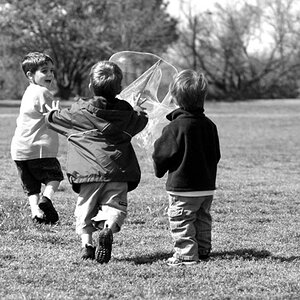
#2 is pretty good. A little over exposed but some people like that for kid shots. <shrug>
#1 looks like it was either taken in a mirror, through a window, or has camera shake. The reflections are too interfering or don't interfere enough to pull off an "effect". Also you cut off one poor little guy's ear. Poor kid.
#3 has blown out detail that I'm pretty sure you could get back in an editor - especially if you shot it in RAW. There's something else about it too - not sure what... Maybe too centered? The angle is working? A combo of the two?? I dunno... something.
In all I think it's a pretty good effort. Keep them coming! :thumbup:
I actually liked #1 because of the blurry-ness in the background, but I do get what your saying about cutting the little boys ear off.
As for number 2 I really don't think it's over exposed, at least in my monitor it isn't, maybe it's just the plain white door that makes it look that way.


![[No title]](/data/xfmg/thumbnail/40/40285-2ce5915035c220ccb3485030863b62d0.jpg?1619739408)
![[No title]](/data/xfmg/thumbnail/36/36395-66eaff4565ecf4245f13a9c469a9273b.jpg?1619737548)

![[No title]](/data/xfmg/thumbnail/33/33440-0778f3522902634844facab43c5a29fa.jpg?1619735969)
![[No title]](/data/xfmg/thumbnail/38/38262-10a9668da9a2b36a92cddde57caf87bc.jpg?1619738547)
![[No title]](/data/xfmg/thumbnail/32/32165-6bb394c486dda7ec16d8fee786f03151.jpg?1619735234)