Ink's architectural 52 weeks photo challenge

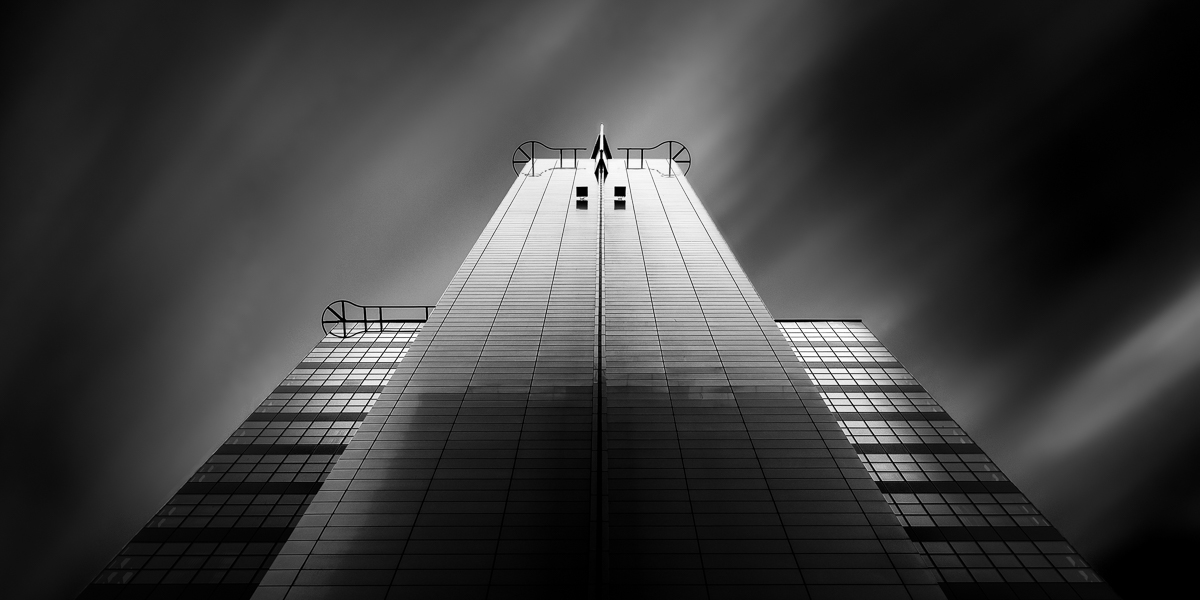
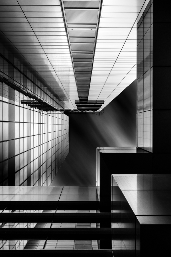
Taking into consideration a few pieces of advice that I've get already, I would like to present second version of recently uploaded photo. I'm very curious what You guys think about it. Is it any better?


- Week 2a -


ICHOT #week 2 (2nd version) by rzuc-butem, on Flickr
 
I hope this one will suite You better than the last ones...

- Week 4 -

 
Hello there!

I'm keeping on despite lack of critique from Your side!
If You have any ideas what can I improve - please post! All feedback is appreciated.

- Week 5 -


Apartment - #week 5 by rzuc-butem, on Flickr
 
I couldn't tell a difference from weeks 2 and 2a. Sorry.

3 has good lines but I'm not in love.
4- I like the two outside shots best; but im viewing from tapatalk on mobile so the details are lost in the middle photo for me.

Week 5- the sun spot is distracting. Im also almost curious to have seen it in color. I like the b&w fine and all but I just like it-not love it

I'll disagree and say that I like the processing and the sunspot on five. Really nice framing too. [emoji106]


Sent from my iPhone using Tapatalk
 
Thanks a lot. I was afraid that it will be perceived as too ordinary one. From the one side I could definitely agree, although bearing in mind that it is hard to always find exceptional motive I've decided to post it on order to find out If I'm on track in such ordinary scenes.

What about the seventh?
 
I like it a lot
 

Most reactions

New Topics

Back
Top