mmaria
Been spending a lot of time on here!
- Joined
- Sep 4, 2013
- Messages
- 6,494
- Reaction score
- 2,991
- Location
- Wonderland
- Can others edit my Photos
- Photos OK to edit
Last edited:
Follow along with the video below to see how to install our site as a web app on your home screen.

Note: This feature currently requires accessing the site using the built-in Safari browser.
")
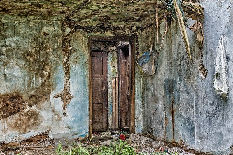
I need to definitely do the lasik! This is the second photo I got "too sharpened" commentinteresting shot, its a bit overly sharp for my taste. It could also use a bit more depth to it as far as colors go. I also like to shoot pictures of doors. I had a little photo theme a long time ago with rustic doors.
I also think in the case some vignetting would be great to draw in the eye.
In my defense, Flickr additionally sharpen photos, my original isn't that sharp.I was afraid of what you'd say when I saw you commentedI like it. I don't see it as over sharp so much as it feels like a painting or a drawing.
I love the subdued colors. If anything, I think I would crop the left side so that the doors weren't in the middle of the frame.
Edit: I tried my suggestion and I'm not sure the crop works any better than your original. [shrug]
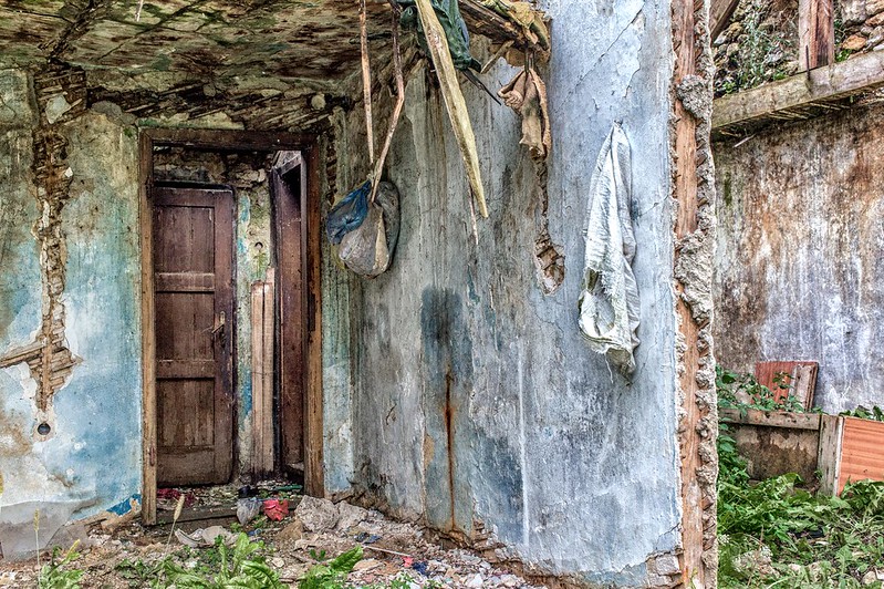
I changed the title... I didn't wanted this to be just about the doors, otherwise I would shoot just them. I wanted walls and all distracting elements in the picture.I hope you don't mind, I cropped it to a vertical format.
View attachment 88857
(edit) I don't like the doors being centered in my cropped version, but I was trying to minimize the distracting elements to either side of the doors.
Please don't get rest and realize that the picture sucksI love this, Marija!
I like Designer's crop too. But right now, I am WAY too tired to trust myself to really "SEE" it, so I'm not going to give any more critique than that. Just that my first impression is that it's really interesting!
you know what I want to hearI like it just the way it is Maria without crop.
yeah... I was thinking exactly the same but I couldn't physically approach and move myself to the spot I thought it would make the best composition and the best photograph.It seems a little disorganized to me, with the left and right sides not really working together. To me the arrangement of stuff on the right-hand wall is more interesting, so moving to the left and shooting more directly towards that wall, with the doors on the left edge would have worked better. My two cents, fwiw ...
Your English makes me feel so much better about my English

![[No title]](/data/xfmg/thumbnail/34/34346-f7996f51f0624620cfd54a488abeacf9.jpg?1619736382)
![[No title]](/data/xfmg/thumbnail/30/30996-79ed44b1137a7c3ab5b0a1146b111238.jpg?1619734559)
![[No title]](/data/xfmg/thumbnail/30/30992-773558233723ab0d28c307a97a1a2427.jpg?1619734556)

![[No title]](/data/xfmg/thumbnail/30/30995-7e48e5498fe9a56ea3d405cf87f3a1ec.jpg?1619734558)
![[No title]](/data/xfmg/thumbnail/30/30994-49c5521f7b5b417f49dcd43891cbec27.jpg?1619734557)