Jeepers Creepers

teneighty23

TPF Noob!
Joined
Jan 6, 2009
Messages
356
Reaction score
0
Location
Northern Alberta
Can others edit my Photos
Photos NOT OK to edit
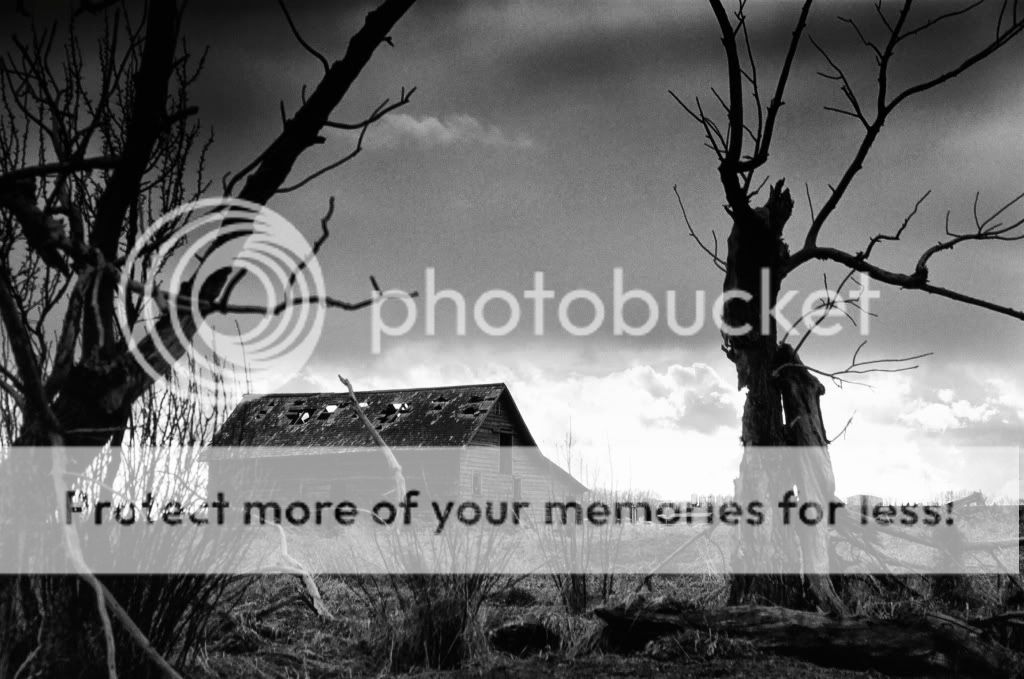
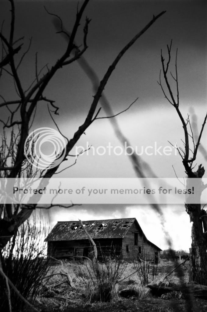
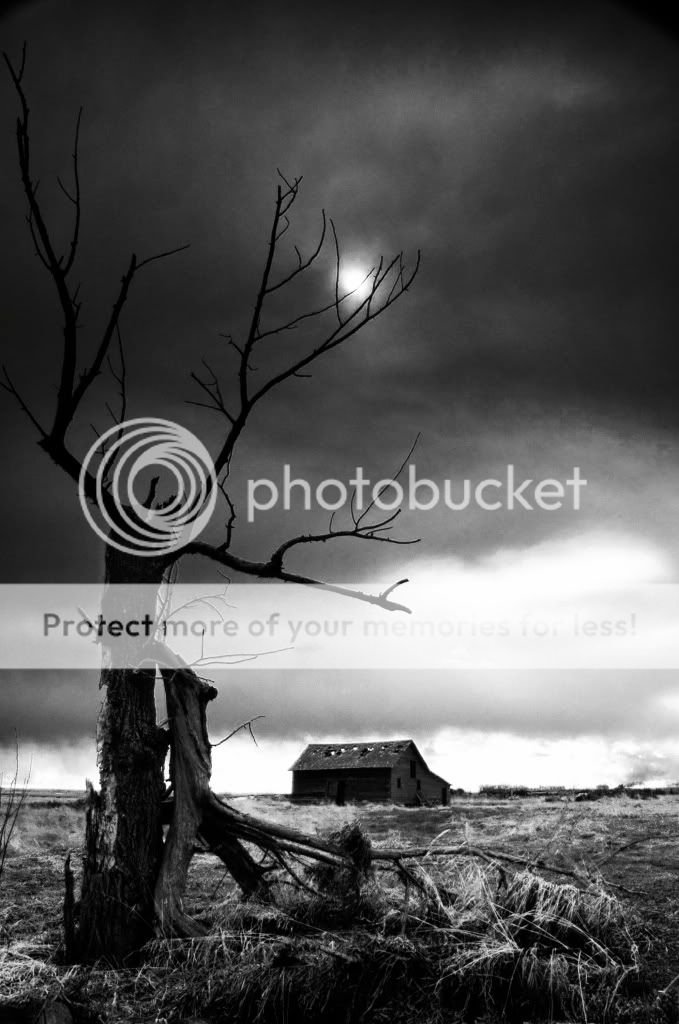
this whole area was a mouse nest, hawks flying all around. and a storm was passing on through. perfect.

#1
00360007-Version2.jpg


#2
00360012.jpg


#3
00360008-1.jpg


#4
00360014-Version2.jpg


#5
00360004-Version2.jpg
 
They are very very good. number 4 stands out for me. I wish the top of the tree wasnt cut out though.
nice work.
 
I quite like #2 and #4 primarily for the exposure.
Don't mind the crop off the top of the tree in #4, but, I think the partial branch over the shack in #2 would be better removed.
The highlights may perhaps be a wee bit strong, but because they are smaller areas, I don't feel they are detrimental.
Good job.
 
How did you stretch the perspective on these... It looks like the same dead tree in all the photos and the barn is the same orientation, but in #2, the barn looks fairly close the the tree, but in #4, it looks like the house is way way behind the tree. Is this just the lens. I'm assuming #4 was using a wide angle and #2 a longer lens?
 
Thanks for all the comments everyone!
How did you stretch the perspective on these... It looks like the same dead tree in all the photos and the barn is the same orientation, but in #2, the barn looks fairly close the the tree, but in #4, it looks like the house is way way behind the tree. Is this just the lens. I'm assuming #4 was using a wide angle and #2 a longer lens?
Yea these were shot with a couple different lenses, wide angle 17-40 mm for #4 and zoomed right in at 90 mm for shot #2, the wide angle lense has some pretty hardcore distortion, especially for shots that you include the ground right in front of you, looks triiiiiiiippy.
Edit:these were shot with a 35mm camera, so the lense focal lengths are for 35mm or full frame sensor digi.

I quite like #2 and #4 primarily for the exposure.
Don't mind the crop off the top of the tree in #4, but, I think the partial branch over the shack in #2 would be better removed.
The highlights may perhaps be a wee bit strong, but because they are smaller areas, I don't feel they are detrimental.
Good job.

Thanks SympL, your comments are held in high regards! i did a little bit of editing. toned things down a tad. more of a traditional B+W than infrared feel.

#6
00360012-1.jpg


#7
00360014-Version2-1.jpg
 
#1 and 4 are my faves
nice focal points, atmosphere and contrasting
definetely suits b&w
i just love dilapidated bulidings
 
They're all nice but 2 and 4 also were atop my list. I like 4 better than 7. Good work.
 
The first is killer. I like the tree on the right. It looks like the guy has a very anxiety-ridden tale to tell.
 
Now this is a fun series to look at! I really like how you explored the possibilities here, and it is difficult for me to pick a "best" because each one can stand on it's own, without being a part of the series. Nice.......

Marc
 
Number 4 really stands out, the rest are ok.
Would work well as a series, but individually they all lack emphasis except number4.
 
To be honest I'm still liking #2 and #4 the most.
Just #2 with the bit of branch gone.
When you toned them down you lost the detail on the front of the shack. I think keeping that exposure is more important than toning down the overall highlights. As I suggested before they are not detrimental in my opinion.
Its worth spending a bit of time because I feel these two in particular could go on the wall.
Good work.

thanks a lot everyone, this is upping my confidence, i will definitely be keeping these comments in mind, cheers!
 

Most reactions

Back
Top