Junior Prom (4)

iBats

TPF Noob!
Joined
Nov 15, 2009
Messages
460
Reaction score
0
Location
philly
Can others edit my Photos
Photos OK to edit
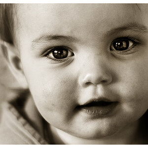
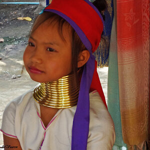
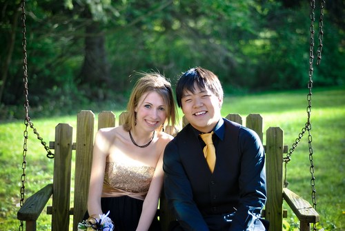
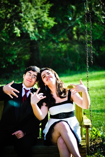
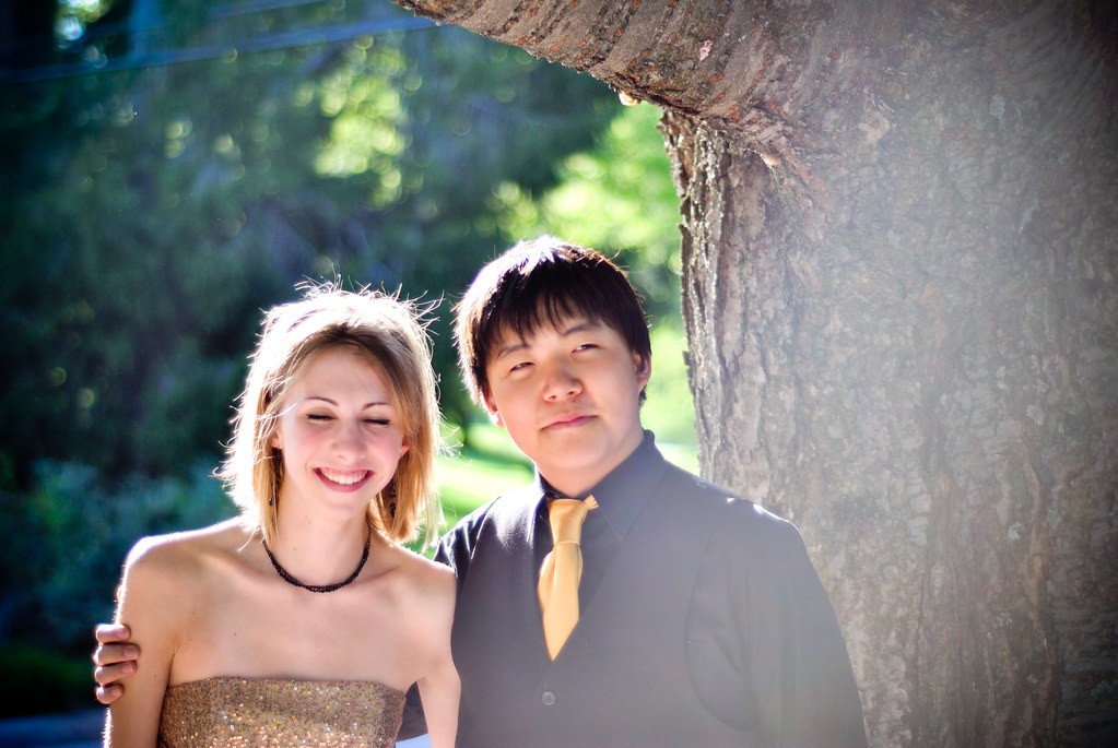
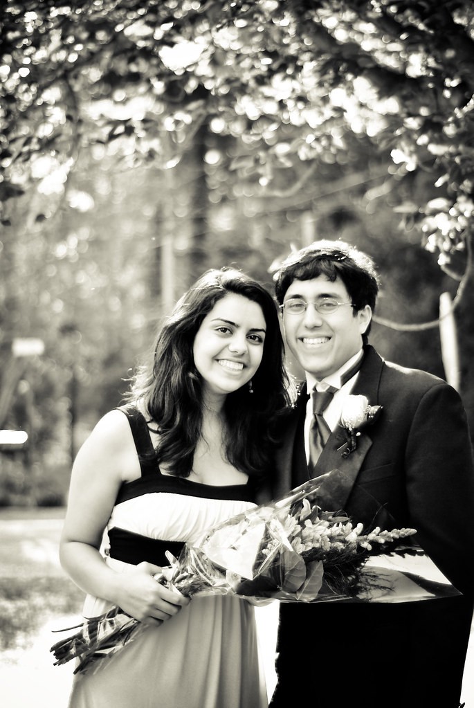
So i was hired by some parents to do some portraits for junior prom and these are the ones that turned out ok.

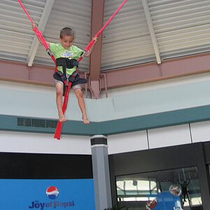
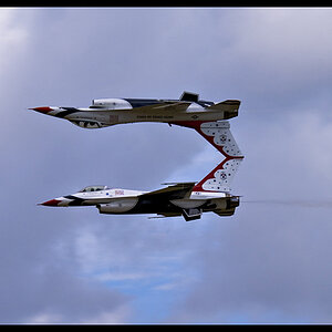
what do you think, this was my first time shooting portraits

1.
4547441114_5a5fd999f3.jpg


2.
4547441342_f8c85fdc67.jpg


3.
4546805777_d65172e794_b.jpg


4.
4547440220_16eb98782c_b.jpg
 
In general, the lighting takes away from the photos.
#1: That streak of light on the girl and on the side of the guy's face is super distracting. Also feels like the background is better exposed than the subjects.
#2: Probably the most blown out of the set, the contrast is wayyy too high and there is almost no detail in the guy's suit. Fix the curves and levels on this one. :)
#3: The fogging really fxcked this picture bad. And the highlights are way too strong, overpowering. Look at her hair.
#4: Unless you wanted it that way, it seems like a greenish (?) B&W. I also think the contrast is too much in this one.
I understand it was your first time shooting portraits, so you have plenty of time and future experiences to grow from :)
 
I agree. Each of these photos has major problems. I clicked on your flickr link and saw several other prom photos that are much better. I'd say the you need to work on your editing ability more than anything else. Choose the best shots. Put your best foot forward.

I also noticed quite a few shots have body parts cutoff. It seems intentional. Was it?
 
The DOF looks nice but there is so much sun glare hitting the lens. A hood or even placing your hand over the top of the lens might have helped.

I like the setting for #2 but not the framing of the photo. Turning the camera horizontal may have made this photo better. Also the sun spot on his jacket is grabbing my attention. same with the sun over the chest of the girl in #1.

I like #4... Nothing that I can see wrong with it. Nice one!
 
#1: That streak of light on the girl and on the side of the guy's face is super distracting. Also feels like the background is better exposed than the subjects.
#2: Probably the most blown out of the set, the contrast is wayyy too high and there is almost no detail in the guy's suit. Fix the curves and levels on this one. :)
#3: The fogging really fxcked this picture bad. And the highlights are way too strong, overpowering. Look at her hair.
#4: Unless you wanted it that way, it seems like a greenish (?) B&W. I also think the contrast is too much in this one.
I understand it was your first time shooting portraits, so you have plenty of time and future experiences to grow from :)

She said it pretty good, didnt feel the need to repeat it.

They just look way too "rushed" and "last min" to me... :confused:

The light and streaks totally kills it for me.
 
In addition to the comments above, I feel there is too much head room in picture one and two. The trees doesn't add to the picture. Number 3 is not a keeper. The girl's eyes are close and I doubt she will want to keep it. Number 4...looks like he have a branch coming out of his ears.
 
I would be more careful in posing subjects. If you look at 2 you can look right up the girls dress.
 
In addition to the comments above, I feel there is too much head room in picture one and two. The trees doesn't add to the picture. Number 3 is not a keeper. The girl's eyes are close and I doubt she will want to keep it. Number 4...looks like he have a branch coming out of his ears.
Hmm, for #3 I thought she might have been laughing, but that's also a good note, if she isn't!:thumbup:
 
I like #4... Nothing that I can see wrong with it. Nice one!

It doesn't look blown out to you? Maybe 1 stop over in my eyes. And as someone else stated, the branch in the ear is very distracting.

I would be more careful in posing subjects. If you look at 2 you can look right up the girls dress.

I think I almost broke my mouse I was scrolling up so fast. :mrgreen:


p!nK
 
P!nk...shame on you...she is a child!! But thanks..I needed the laugh!
 
In addition to the comments above, I feel there is too much head room in picture one and two. The trees doesn't add to the picture. Number 3 is not a keeper. The girl's eyes are close and I doubt she will want to keep it. Number 4...looks like he have a branch coming out of his ears.

lol she has it set as her profile pic on Facebook
 
I actually think your other shots from that day your flicker are much better. Out of the ones you posted I like number 4, but the contrast is too high and his face looks out of focus as well. The sun looks like it was pretty bright that day and pretty high.
 
I like the last one the best!
 

Most reactions

New Topics

Back
Top