I agree with Mike. I think if you can apply that contrast to #1, it will be stunning as well. It's just lacking a little punch.
The shot of the flowers I feel could be a shade or two lighter, and perhaps a bit more contrast, and it would really pop.
For the last one, I would give boost the contrast on just the elephant. Use a curves or levels adjustment layer and mask off the background on the top so it retains its' current contrast.
I love the shot of the elephant. I just kept looking at it's eyes! I've never noticed where an elephant's eyes were.
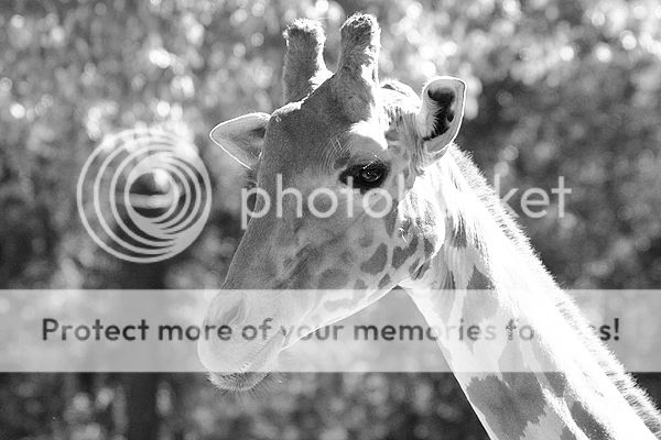
The 2nd giraffe is awesome. The spots are so clear!
Untill I found this forum, I never would have even thought of converting or shooting b&w. These are perfect examples of why I try almost every one of my photos in b&w now.
:thumbup:
The second giraffe shot is excellent but to me something just is not right about that elephant shot. For me the look of the image is just not right, sorry.
Two and three look great to me. I think the contrast is good. You could fool around some more and others might think its too much. Different feels for each Individual.


")
![[No title]](/data/xfmg/thumbnail/34/34345-5642c495cae8d6c7bb83c28664146cf1.jpg?1619736381)
![[No title]](/data/xfmg/thumbnail/30/30992-773558233723ab0d28c307a97a1a2427.jpg?1619734556)
![[No title]](/data/xfmg/thumbnail/30/30994-49c5521f7b5b417f49dcd43891cbec27.jpg?1619734557)
![[No title]](/data/xfmg/thumbnail/34/34346-f7996f51f0624620cfd54a488abeacf9.jpg?1619736382)
![[No title]](/data/xfmg/thumbnail/30/30993-7c6dca4375064e92f2ea6cbfabf9b59e.jpg?1619734556)
![[No title]](/data/xfmg/thumbnail/32/32941-f21147be61c00828a23d6ce011d840eb.jpg?1619735773)