Just practicing and would like feedback

ChristyV

TPF Noob!
Joined
May 4, 2016
Messages
2
Reaction score
2
Location
Lancaster, pa
Can others edit my Photos
Photos NOT OK to edit
Be kind! I'm totally new at this and have begun to take a few portrait photos for my friends. If you would like to check out my work and comment, I'd love to hear! Thanks.

Photos are in my profile!
 
You can post a few right here.
 
Nice start!

For the "first couples" picture, I'd say watch the pose. IMO, her arm is a tad distracting and looks somewhat awkward since it's cropped. Next time, she could simply put her arm down and out of the frame. Otherwise, I like the connection between both of them. Their faces are in the shadows, so some light would be nice to see their faces better.

I like 37949, but the camera should have been tilted up a bit more to avoid cropping her head.

The "couples portrait" with the two looking at the camera is nice. There is a bit of negative space on the left, but I like it.

I also like the "couples portrait" with the two embracing; however, I'm not a fan of the negative space on this one. I could easily see this in portrait rather than landscape.

ETA: also, in the last one, I'd say watch the posing. Her arm with the guy's hand on her back is a bit distracting.
 
1. Post it here, most members will not bother searching for it in your profile.
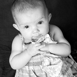
2. Your photos are not bad at all for a totally new one. If you are a total beginner as you state, you have an excellent eye. I like the way you fill the frame, this is rare amongst beginners. I have no problems with tight cropping, it shows that you are not afraid of a close-up, which is good. There are things that could be improved but it is really minor and technical (like soft focus baby eyes of blowing the man's white shirt), and I am not a portraiture photographer, so there are forum members who are far far more equipped to give you a professional advice. I hope they will chip in, since your pics and ability clearly deserve that, but as I said, post it here. Good potential there.
 
Photo "Couples portraits" in the album "My First Photos" by Christy at ChristyV

Not too bad technically! But a word of advice: you can NOT slap people off to the short side of the frame, and call this "composition". This is NOT good composition, in any way, shape or form. The "rule of thirds" is a new, made-up concept, it has no basis in real fine art...but it is talked about as if it has a long history: it does NOT.

This shot: 33785-1462372348-2ec9e3e82b91e6936f86c8b809dba4ba.jpg

The man and woman kissing, placed way over to the right hand third, then 2/3 of the entire frame area devoted to brushy, scrubby trees. And what is that thing that is sprouting out of the man's head? This is not studied, this is not appealing, this is very commonly seen today by people without formal training or study or some type of visual arts background, but it is seen sooooooo often, people are now thinking it's acceptable to do this, in this way. It can be...but not in this exact way. The so-called "Rule of Thirds" is a modern, made-up, Popular Mechanics magazine invention, and following the idea that there are "power points" that can magically make a composition good is not true. You have devoted 2/3 of the frame to ugly, scrubby trees, and placed the people so far to the right hand side that it is causing visual tension--in what i supposed to be a romantic, close-in, personal dual person portrait. But the trees get the most frame area. THis could have made a beautiful vertical composition, or a lovely square image.

33784-1462372149-714b3b56c80dee2d9315258502daccd5.jpg
Wayyyyy yellow. Ring is not shown off well, needs to be turned toward the camera's eye. He's looking down and away, she looks toward the camera--discordant emotional states, but you have a personal; affinity for it. And again, off balance due to I think, a ROT understanding/devotion to that is overrriding good compositional balance.

And then this one:

33783-1462371985-e72df450e1e91e6bbd7b215519cc5148.jpg

A properly frame, properly-oriented two-person portrait with prototypical foreground bokeh that conveys depth and three-dimensionality with a very Asian flavor in how the out of focus grasses are used perfectly, and her straw-colored hair perfectly echos the straw! Extremely advanced work there, with something that many Western viewers are unfamiliar with, or think is simply awful: using OOF foreground foliage as a compositional and thematic element.
****
Verdict? This is your first work? Wow.You have terrific potential to become very good.
 
Last edited:

Most reactions

Back
Top