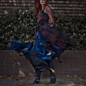
Well, that's a really nice one (again ). She appeals to the knight in me, the one who wants to save the damsel in distress (even if she's not in distress). That stone looks rough and cold and hard. Somehow I am thinking she's sitting at the base of a castle rampart, and, and... well I don't need to be logical about this do I?
Ah Marija. Catching a glimpse of your posted work is like catching the strains of Vivaldi or Mozart wafting out of an open window that I have passed while walking by.
Being a Scot, I think this could be the pinnacle of your career. Just rest her feet on the Stone of Destiny (Stone of Scone - Wikipedia, the free encyclopedia) and job done. You could reside in the knowledge that you just produced the best image in the world.
She's lovely, but some things about this image make me stop and wonder...
It's sort of an oppressive scene... the gray stone, the imposing wall on the right, her eyes closed, her body scrunched up in a way... and yet her color is bright and rosy. It just feels like her tones don't match the setting and the whole image just needs a bit of an adjustment.
Also that wall on the right... it's interesting and lends depth, but at the same time feels a little distracting.

 glad you like it
 ). She appeals to the knight in me, the one who wants to save the damsel in distress (even if she's not in distress). That stone looks rough and cold and hard. Somehow I am thinking she's sitting at the base of a castle rampart, and, and... well I don't need to be logical about this do I?

![[No title]](/data/xfmg/thumbnail/31/31035-96228fec87f6f8e8b5f3db4e93e99189.jpg?1619734580)