DGMPhotography
Been spending a lot of time on here!
- Joined
- Mar 23, 2012
- Messages
- 3,160
- Reaction score
- 718
- Can others edit my Photos
- Photos OK to edit
C&C please! ")
1
2
3
4
1
2
3
4
Follow along with the video below to see how to install our site as a web app on your home screen.

Note: This feature currently requires accessing the site using the built-in Safari browser.
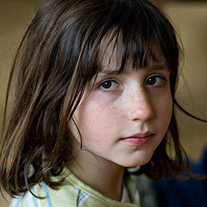
Beautiful lighting and post process. IMHO however, her expression doesn't go with the poses.
Thanks! What would you suggest?
Thanks! What would you suggest?
It's hard to say since these are all non-verbal communication queues, and we interpret them differently.
For example on #2, her hand gesture communicates a soft feminine pose (I use that pose a lot too) but her facial expression looks forced. Plus the lighting is dramatic for the pose so although technically it's a beautiful photo, it's visually a bit confusing for me. I'm not sure if you did this intentionally as a test but that's just my observation. What if you try matching lighting, poses, and expression?
Some general observations of the set as a whole:
She doesn't have a typical model look, including her expression(s)...and that's okay with me. I think sometimes as photographers we get too caught up in what we would like the result to be, or what we read into someone else's photo, that we forget the sometimes it's just about the client/subject. You don't say whether this was shot for her or for your benefit, so I'm fine with the mixes of poses and expressions.
That being said, there are a few suggestions I can make about these shots. First, they all are cropped slightly differently, so they seem disjointed as a set. They are also cropped very tightly - give the poor girl some room to breathe! If these are for her as a client, she'll have a tough time framing them without cutting parts of herself off (or at the least making her look really boxed in). If these are for you, pick the aspect ratio you're working with for your portfolio and crop her to best fit that space. Sometimes that even means adding some dead space to the frame and dragging the background to fill it.
Also, while I don't mind the poses on their own merits, pay attention to how they work with your subject's body. In this case, shots 2-4 all have her left arm flat against her body. Particularly since her arms are bare, and this arm is very square to the camera, these poses make her upper arm look much flabbier than it does in shot 1. If you have her pull her elbow out just a touch, you can eliminate this flattening of her upper arm without changing the pose noticeably.
. Am I supposed to have a certain aspect ratio for my portfolio?
If you are presenting images or thumbnails in a grid, wildly varying aspect ratios are going to seem disjointed.