Landscape shots

Big Mike

I am Big, I am Mike
Staff member
Supporting Member
Joined
Dec 16, 2003
Messages
33,896
Reaction score
1,853
Location
Edmonton
Website
www.mikehodson.ca
Can others edit my Photos
Photos NOT OK to edit
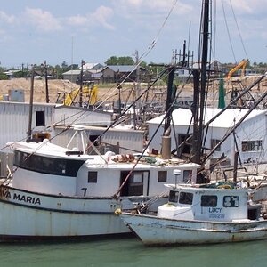
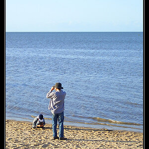
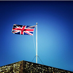
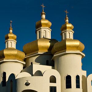
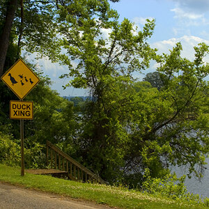
Here are some photos I shot while up at the lake a few weeks ago.

#1
SL-02.jpg


#2
SL-03.jpg


#3
SL-04.jpg


#4
SL-05.jpg


#5
SL-06.jpg


#6
SL-07.jpg


#7
SL-08.jpg


#8
SL-01.jpg
 
Very nice! I do like #4 a lot. My favorite, though, is the first one. Sometimes too much purple is hideous, but it looks great on this one :D
 
MIKE THESE ARE VUNDERBAR! #1.2,3 have the feel of a cold ocean vista.
 
Love 1, 2 and 3. Wonderfully weird yellow sky. Nice composition, etc.

The rest does not do much for me, sorry.
 
Hi Mike. Honestly, the first few felt kinda flat and dark to me... probably dark would have been fine (since it was dark) if there was more contrast or more saturated colors. They actually look kind of underexposed. Most notably the first one.

The compositions on the first two seem unfortunate to me. I think there is more interesting stuff in the second one, and I think the dock being the clearly central point of focus lends itself more to the portrait perspective, but even with that the composition left me feeling uninterested. (very centered, the dock is leading our eye to essentially nothing but the horizon (hard to help, I admit), etc.)

It seems like you might have been able to play a bit off those couple rocks sticking up through the surface of the water, push the dock off to the right, perhaps angle it to the left, etc. Not sure.

I did think 4 and 5 were kinda nice. Not overly unique, but a really nice example of that kind of shot, very well exposed and with obviously beautiful skies. You also managed to get the sun in the shot without totally screwing up your exposure which is no easy task.
 
Thanks for all the comments.

Where are you finding water around Edmonton?
This was Lesser Slave Lake, 2nd or 3rd largest lake in Alberta.

Hi Mike. Honestly, the first few felt kinda flat and dark to me... probably dark would have been fine (since it was dark) if there was more contrast or more saturated colors. They actually look kind of underexposed. Most notably the first one.

The compositions on the first two seem unfortunate to me. I think there is more interesting stuff in the second one, and I think the dock being the clearly central point of focus lends itself more to the portrait perspective, but even with that the composition left me feeling uninterested. (very centered, the dock is leading our eye to essentially nothing but the horizon (hard to help, I admit), etc.)

It seems like you might have been able to play a bit off those couple rocks sticking up through the surface of the water, push the dock off to the right, perhaps angle it to the left, etc. Not sure.
Thank you, I really appreciate the thoughtful critique.

If it's not already obvious, the first three are HDR images made from at least three separate exposures.
I spent a fair amount of time on the first one, going back and forth with different processing. I was going for a darker feeling image, I think it goes with the composition that leads to nowhere. I really wanted it to work in B&W but I just felt it portrayed the mood better with the dark, subdued color tones.

Sort of the same deal for the 2nd one. This one had some really nice colors playing on the sand/beach, but it just didn't fit with the mood so I knocked it down.
I may revisit these shots later on, as I feel I just didn't get exactly what I was going for...but I think part of the problem was the boring sky/background. Maybe I need to drop some mountains in back there.
 

Most reactions

New Topics

Back
Top