Large collection from my first PAID wedding.

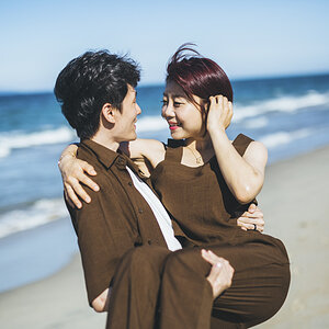
I think over all they are really good! Quality of picture wise. I don't think the bride will be very happy with 1. or 2. because she's not looking so good in them....but she looks very nice in the rest and I think they'll really LOVE them!!
 
not to paid wedding photog standards.
sry.
 
not to paid wedding photog standards.
sry.

This really isn't constructive. As I said, I appreciate criticism, but the general statement doesn't help. Tell me what to work on, what to fix, how to fix...
 
I have been working on some of the PP. Are these any better?

18.
759811391_5XX4v-XL.jpg


19.
760411558_3nTNK-XL.jpg


20.
760757064_yCCq8-XL.jpg


21.
760195177_Cxzhs-XL.jpg


22.
760757010_9PLs2-XL.jpg


23.
760195231_Kyxnk-XL.jpg
 
some more...

...please some C&C. I hope that I am improving, and if so, I attribute it to the C&C I get from here. Thank you for any assistance.

24.
761084957_oRnTm-XL.jpg


25.
761093865_7E29X-XL.jpg


26.
761109769_442t9-XL.jpg


27.
761548712_vvx5K-XL.jpg
 
Much, much better!

This advice is more about customer photos in general, not wedding specific since I don't do weddings, never-ever let a paying customer see a shot you took that makes them look worse than they are. They will not be able to let it go and look at the rest of the shots you have for them.
This applies to all customers but even more to women. This is not a slam on women or anyone, but my experience has been once they see an awful picture of themselves, that you took, they remember it and have a hard time moving on to the awesome shots you took.

In this thread I think you might have gotten more helpful feedback if you had started with "I need to save these shots from a recent wedding, any advice would be appreciated"

Thanks, and you are probably right. I completely started over again with the RAWs. There was a comment on color, so I worked at removing any strange hues from bouncing the flash. The big comment that stayed with me was the one about flattering the bride more (different verbage was used). I completely revamped my skin softening strategy, whitened smiles and the sclera of the eyes. I tried to add some more contrast as well. I am much happier with these, but I am sure the harsher C&C has yet to come.

I'm ready, and waiting to improve. Obviously, at this point with these images, post-processing is all I can work on. Composition and lighting C&C will be applied in the future.
 
I think you went a little too far on thee PP in #26. Especially on the guy - he looks like he has a ton of make-up on.

I kinda like #24, but I would crop it a little to get rid of those fingertips (?) in the bottom left corner. If you don't want to crop too much rotating it a little will accomplish the same thing, and since it's already at an angle probably wouldn't look much different.

23 Is nice, but I would tone the vignette down some, personally. Wish there was a little more space on the side of the groom too... Getting pretty close to the edge of the framed. If this were printed and framed, part of his arm probably would be under the edge of the mat/frame. The version of this in #14 looks better, but even on that one, I would crop a little to center them up more. Just don't take any off of his side.

In #21, it looks like his eyes are a little soft... Otherwise, I like that one.

Is 25 the same as 6 from page 1? I like it, but I think it would be better with a little more light on her reflected image in the mirror.


Thank you so much.

Pretty much everything you said was something I said to myself as well, and was waiting to see if my own criticism was right.

I agree with 26, and was planning on fixing that. I've looked at it about 100 times wondering if I should, or if it would work. I have seen successful wedding photogs over soften skin, and it seems to work for their style.

The finger tips were killing me on 24 as well. In fact I have already fixed it and I thought that I put the new crop in this thread but I guess not.

I was wondering about the vignette in 23... I kind of wanted that dreamy feel, maybe I will mask it a little better. I also wish I would have gotten the composition right with it. I am always thinking in the back of my head, 'fill the frame', but I guess when you actually apply a frame, you do lose so much of the picture.

Didn't notice that the eyes were soft in 21, but now I can see what you are saying.

25 is the same as 6, I just tried to add a little contrast. I know the lighting wasn't good for the reflection. I wish that this was the one that I focused on the reflection instead.

Thanks again, this is really helpful.
 
What do you guys think about this one. I actually had to clone her left eye from the right because it was so underexposed it lost all of its color. I think I did a good job, does it look symmetrical?

28.
761599129_cE75r-XL.jpg
 
Also posted in professional gallery.

This was a low budget outdoor wedding. Luckily I work for real cheap right now. Always looking to improve, and I know I can't compare to most of the wedding guys on here, so C&C please. I'm not sensitive so let me have it.

4.
758866440_Rw6BD-XL.jpg


759038249_aazZA-XL.jpg
How do you go about editing the skin? I gave a crack at it, but I guess I was just tweaking a tweaked photo, and jpg at that.. But I uploaded a .tif file with all my layers open that you can load into PS to see another way of doing it...
workopen.tif

workjpg.jpg
 
That looks good.

I was doing a Noise>Median layer with a radius of 10, then masked out the eyes, and dropped the opacity to 50%.

Now I use surface blur with radius about 13 to 15, and I adjust the threshold between 10 and 20. Then I mask out eyes, and everything other than skin and drop the opacity to taste.
 
oh yea, I sharpen and do a dust and scratches layer as well prior to smoothing.
 
I use a few different layers..

I use the clone tool to fix the area under the eyes, and any obvious blemishes/lines.
Ctrl J to duplicate background.
Use Topaz remask to separate the skin of the face and neck from the rest (cut around eyes and lips aswell)
Then duplicate that layer
The first skin layer goes through Topaz's Clean Even skin mode
The top skin layer goes through High pass filter to bring out some of the texture to make it look more realistic and not just blur (pores, etc). Then select soft light for it.
show all layers and adjust the bottom, background layer until you are ok with it.

Then I flatten.
 

Most reactions

New Topics

Back
Top