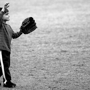
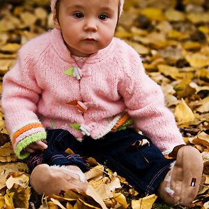
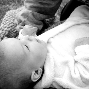
the pose is weird. It's not flattering, because it makes her head look bigger. And the negative space behind her also doesn't do it for me. I think the color and light are okay, but that's not enough to make this one work.
Well, I'm a noob here and to photography in general, but I think if you move her to the left 1/3 of the frame, her eyes are going to have to focus on the right 1/2 of the frame. Otherwise the photo is going to be very unbalanced.
Well, I'm a noob here and to photography in general, but I think if you move her to the left 1/3 of the frame, her eyes are going to have to focus on the right 1/2 of the frame. Otherwise the photo is going to be very unbalanced.
Well that is if you move her in the frame as she is right now. The idea is that you put her more to the left (or better, your camera more to the right) while you are taking the picture. So she will be facing the camera of course and it will all look balanced.
Well that is if you move her in the frame as she is right now. The idea is that you put her more to the left (or better, your camera more to the right) while you are taking the picture. So she will be facing the camera of course and it will all look balanced.
Yes the lighting is what the concern is more so than anything. I will fix the other issue's down the road but thnx for all the input which is what i was wanting. I am trying to work on gettin the lighting consistant.
Yes the lighting is what the concern is more so than anything. I will fix the other issue's down the road but thnx for all the input which is what i was wanting. I am trying to work on gettin the lighting consistant.
the pose is weird. It's not flattering, because it makes her head look bigger. And the negative space behind her also doesn't do it for me. I think the color and light are okay, but that's not enough to make this one work.


")

![[No title]](/data/xfmg/thumbnail/34/34346-f7996f51f0624620cfd54a488abeacf9.jpg?1619736382)
![[No title]](/data/xfmg/thumbnail/34/34343-b06994e286a2089b404358d95c37eaf0.jpg?1619736378)