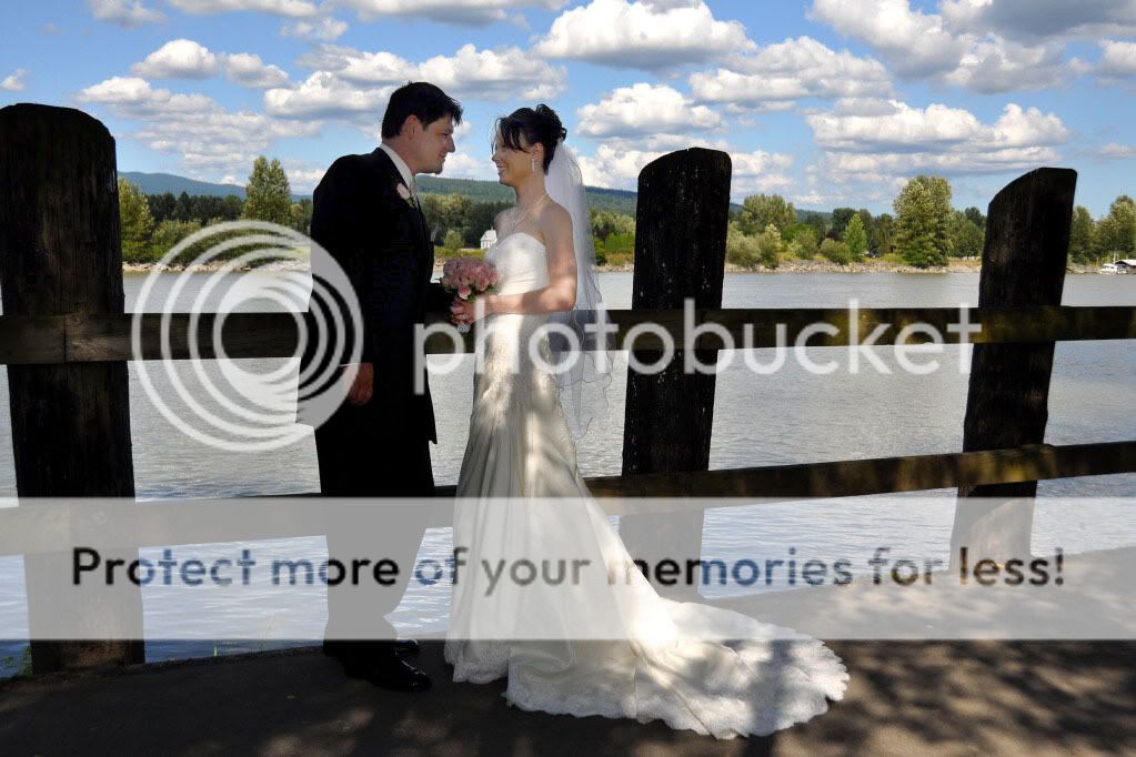
1st one - Excellent composition but lighting is poor. Subject should be the bride and groom
2nd - I didn't really get this one.
3rd - Cool tone, nice pose.
4-6 - my favorites, excellent work.
9 - Is that on camera flash, and it looks like there were a bunch of people taking pictures
OK, thanks guys for the feedback. On photo#1 my flash started
acting up, went from 1/3200 sec. and underexposed severly, then
it jumped to 1/200 sec. and overexposed the next shot. I was
going to ditch the underexposed one but then kinda took a liking
to it. Yes, I use straight on flash for fill, and yes, in the group
photos they are looking all over the place and I'm pi**ed off at
myself for letting it happen.
________________________________________ http://www.dreamworldimages.ca Pet Photography Business Child Photography
Because you posted in the pro section I will give C&C, but please note this is an honest critique, it is not meant to hurt you feelings, just to help you improve.
1) There is no composition to this image as well as being in desperate need of fill flash it also needs a diffuser over the bride. The fact the bride is half lit should make you toss this image, it is not up to par. 2) Fun image, looks like the white balance could be off a bit, but that can be fixed. 3) The background is blown out and he is half lit by sun, which ruins this shot for me, again a diffuser could have saved this shot. 4) Nice, a bit soft for me but that is an opinion. 5) Nice, I am sure the client will like it. 6) I find the blown out area and the flowers taking me away from the rings. Diffuser could have helped here. Are we seeing a pattern yet? 7) Clean up the noise a bit and it is great, might want to check the white balance again. 8) Same image as # 4 9) This could have been a much stronger image with better posing and composition as well if everyone had been looking at the camera, the bridesmaid on the left is looking at someone else. As well the flower girl looks like she was just shoved in there, do you have this one in a vertical shot? 10) This could have been a stronger shot if the Groom were looking at you; you cut the bride at the elbow and right through the hand. This would have been better as a vertical shot; this is a bit weak in composition as well.
Again, this is meant to help you improve, I think you have a great base to build on and I look forward to seeing more from you!
gotta say the edit works well. but yeah, the lighting man. i think it could have been fixed from the start? the shadows are still somewhat distracting.


")

![[No title]](/data/xfmg/thumbnail/31/31980-e5048a424621c7b3cd0d306d63c09d67.jpg?1619735137)
![[No title]](/data/xfmg/thumbnail/37/37614-3833b9d2e46075829c91cf9c0f47af69.jpg?1619738150)


![[No title]](/data/xfmg/thumbnail/41/41905-b622c7d92c817afea0d4f5704e7fb329.jpg?1619739940)
![[No title]](/data/xfmg/thumbnail/31/31979-ea92aca54ae865842d998c9cec534991.jpg?1619735137)