Lighthouse

lostcase_gib

TPF Noob!
Joined
Jan 29, 2008
Messages
341
Reaction score
0
Location
Gibraltar, Europe
Website
www.markgalliano.com
Can others edit my Photos
Photos OK to edit
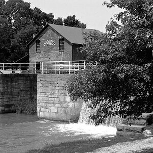
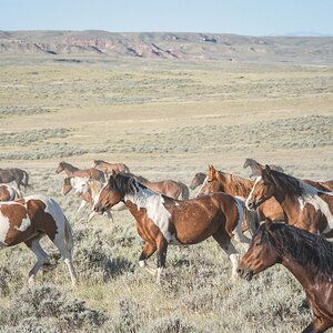
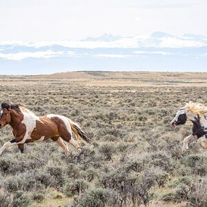
Was playing around with elements and i thought i would leave it here for C&C. Still learning how to play around with curves and contrast and stuff like that. Lemme know what you think.

IMG_4278_B.jpg
 
I personally think it's much too gray. More contrast would help it...that's just my opinion though...do what you like.
 
I agree. ^^^

Check out this tutorial on youtube:


I watched it the other day and it's already helped me produce better tonal images.
 
Last edited by a moderator:
I like the subject (I'm just an old surfer) and the composition (makes me feel like I'm on the cliff wall or one of the seagulls flying near it). The perspective is awesome. I'm waiting for my feet to get wet when the next wave crashes and charges up the wall. I would like to see more contrast though... I think it would give it a more rigid feel.
 
Well been playing around with the curves and things like that a bit now and i have got this image, it is not the one that i posted before as i have given up on that one for today, might try it again tomorrow... what you guys think of this one??

IMG_4265_b.jpg
 
wow, what movement in that wave. Its truely awesome.
 
yes i was lucky, it was one wave forming and one on its way back from crashing against the rocks!

but yeah i think in B&W it gives more of a feel than in colour...
 
Great shot...looks cold,wet & windy.....I can feel it!
 
I think the photograph is too gray and the rock on the right of the photograph is distracting. I like the idea of the image, it just needs some refinement. Keep working on it though. :thumbup:
 
The first one feels bigger, more expansive, but the second one you posted is more dramatic. I like them, personally.
 

Most reactions

Back
Top