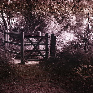
I can't tell if I hit this photo on the nose or not. It's taken 8 total hours logged in front of GIMP constantly playing and nitpicking over this damned photo, so you can tell that I'm still not sure on whether or not the GIMPization came out right. But alas, I need some help guiding the way.
I took this photo...

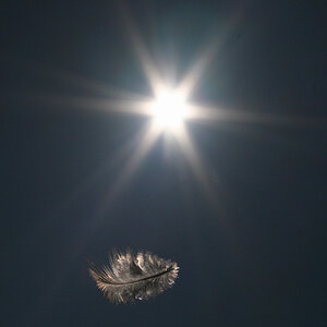
And then GIMPed it into...

Alas, stoarge quality is poor, and as always, simply e-mailing me shall score you a free (non-autographed) high quality copy for furhter judgment :roll: :mrgreen:
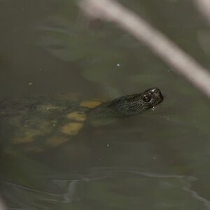
I took this photo...
And then GIMPed it into...
Alas, stoarge quality is poor, and as always, simply e-mailing me shall score you a free (non-autographed) high quality copy for furhter judgment
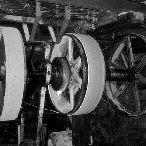
:roll: :mrgreen: If you like this look, you might want to print it out and try it by hand next time.

![[No title]](/data/xfmg/thumbnail/31/31747-2e2e2bda16938a6a1d5fd6120c558293.jpg?1619734987)


![[No title]](/data/xfmg/thumbnail/31/31746-12607d714ca2713b95250821c881aea9.jpg?1619734987)
![[No title]](/data/xfmg/thumbnail/31/31093-5a5bf042a168153ccffbce7a66501050.jpg?1619734610)
![[No title]](/data/xfmg/thumbnail/31/31748-63241c520f250328a5ec32959b8f53d0.jpg?1619734989)