Logo comments

NecroBolt

TPF Noob!
Joined
May 31, 2008
Messages
19
Reaction score
0
Location
Pa
Can others edit my Photos
Photos OK to edit
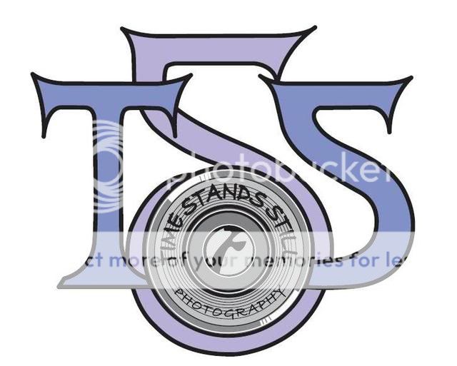
Just starting out with our photography business, which will concentrate mostly on portraits. My friend, who is an artist, has designed this for us. What do you think? We chose the name because both my fiance and I are huge fans of the band RUSH, and Time Stand Still is one of our favorite songs. We thought Time Stands Still has good photography references as well. The logo is in the beginning stages, so please be as critical as you want.

TSSLogo.jpg
 
If you go any smaller with the logo itself, the text in the grey circle (lens?) will be lost. The middle S is not as obvious as the T and second S making it a little tough to know what it is right away. Do you have any other versions to look at? I think it needs a little more thought.
 
I do like the name a lot. I like how the logo wraps around itself, although i think it's a little 'tattoo'-like if you know what i mean. For portraiture stuff i'd say you'd want something a little 'softer'.. good start though.
 
Did you know there is already a TSS Photography? Not sure how much it matters but they are a big franchise that does kids Sports photography & school photos. You can Google it. Just wanted to mention it. I think the logo looks good.
 
I agree with Double H...the small text will disapear when it's smaller, which isn't good. The 'S's look more like '5's to me.

I like the concept and the feel of the logo, but I think that when it comes to logos, simple is better.
 
the first thing i was taught in designing logos is to start with black & white and make sure it will look good very small (i.e. on a business card) and go from there.

i think a lot of the detail you have on this one will be lost and possibly, depending on the print job, may cause excessive bleeding/dot gain (of the inks) and blend to a dark "mud" color.
 
In addition to the other considerations for text mentioned above, I would try to make the S in the middle look a little bit more like an hourglass. I think if you did something like that, it would give you a good place to center the text, whether you put it above or below the logo. I'd make everything much smaller too.
 
Did you know there is already a TSS Photography? Not sure how much it matters but they are a big franchise that does kids Sports photography & school photos. You can Google it. Just wanted to mention it. I think the logo looks good.


Yeah, I did google it and figured that since they were nowhere near me, it wouldn't be a big deal. Is it??? I think they are Texas location. I'm in Pa. Very new to this. Don't have a clue as to the legalities of it. I figured that since the logo is completely different... the name isn't actually a problem? Am I right there? Any advice would be welcome.
 
the first thing i was taught in designing logos is to start with black & white and make sure it will look good very small (i.e. on a business card) and go from there.

i think a lot of the detail you have on this one will be lost and possibly, depending on the print job, may cause excessive bleeding/dot gain (of the inks) and blend to a dark "mud" color.


Ahhh... here's the good part. I AM the printer and my artist works in the graphic design department. We already printed out a smaller version of it for a test. The image is direct to plate, so no dot gain. And I'm THE BEST printer, and I have an exceptional press as well. So again... no dot gain. :wink:

We are, however and anyway, looking into making it a bit cleaner. For my business cards and flyers it's okay, but for the website we want a less cartoony/tatooie look. The guy that is designing my website is going to make it much cleaner and REAL looking, instead of a flat two dimensional drawing. Soon as I get another example I'll post it.

Thanks for all the input and advice so far. Very appreciated. :cheers:
 
ya but when you deicide to run an ad in something that prints on newsprint (i work for a weekly alternative) you have to take that into consideration. but you definitely have a hand up on most!
 
I have to say it may be too complicated to add to photos but would be nice IMO on a site and on cards etc. BTW, as soon as I saw the name I knew where it came from because I too am a huge fan. Great selection for your brand! Freeze this moment a little bit longer and make sure you share your work for us to see :thumbup:
 
I have to say it may be too complicated to add to photos but would be nice IMO on a site and on cards etc. BTW, as soon as I saw the name I knew where it came from because I too am a huge fan. Great selection for your brand! Freeze this moment a little bit longer and make sure you share your work for us to see :thumbup:

Always a pleasure to meet a fellow Rush fan. :cheers: Just out of curiosity, are you a member of any of the online fan forums?

I've got to get around to posting some of my work. I'm in the process of getting my website done, so I'll definitely link the site up to my sig or something in a few days.
 
ya but when you deicide to run an ad in something that prints on newsprint (i work for a weekly alternative) you have to take that into consideration. but you definitely have a hand up on most!

Good point. I haven't looked that far down the road into putting the ad in the phone book yet. The guy that is designing my website is going to overhaul the logo so that it isn't cartoony. What I'm going for is the lens to be a real picture, surrounded by a better version of the logo.

The business cards are going to be fold overs, so that I don't have to shrink the line art image too much anyway. All that I offer will be inside the cards. I am also making plain flat cards with just contact info. I am really interested in making my own dvd cards. I need some input on that, so i might make a thread about them. :lol:

Love this place. :cheers:
 
Always a pleasure to meet a fellow Rush fan. :cheers: Just out of curiosity, are you a member of any of the online fan forums?

I've got to get around to posting some of my work. I'm in the process of getting my website done, so I'll definitely link the site up to my sig or something in a few days.


Actually no I am not in any fan clubs. But I do have every album they put out on vinyl, CD, cassette and video :) (as well as some private stuff) I've been listening to them actively since around 1982 and I've seen them in concert in about 5 different states and 2 countries. :D

Time and money had been redirected towards family and hobbies but yeah, basically the radio and tv changing stops when I hear them playing. I would love to see some of your work when you post it. Please be sure to PM me with a link if you don't post a thread about it.

In this economy lately, people have to think differently to survive and one has to become a New World Man in order to get anywhere. Too many people want Something For Nothing and life just isn't that way. With challenges around every corner, life can sometimes test your Grace Under Pressure. I personally am a jack of all trades and I'm tired of working for Joe Schmoe and just getting by while he makes the big money. I am now looking into a few things that I enjoy so much it doesn't seem like work. Unfortunately, it's not paying right now but I know if I work on it hard and long enough it will happen. "We go out in the world and take our chances, Fate is just the weight of circumstances, Thats the way that lady luck dances, Roll the bones"

Good luck with your endeavor Necrobolt, it may take some time but it seems like you are off to a good start :D
 

Most reactions

New Topics

Back
Top