Navigation
Install the app
How to install the app on iOS
Follow along with the video below to see how to install our site as a web app on your home screen.

Note: This feature currently requires accessing the site using the built-in Safari browser.
More options
You are using an out of date browser. It may not display this or other websites correctly.
You should upgrade or use an alternative browser.
You should upgrade or use an alternative browser.
Logo for C&C
- Thread starter NateWagner
- Start date
Flash Harry
No longer a newbie, moving up!
- Joined
- Jun 26, 2006
- Messages
- 1,965
- Reaction score
- 14
- Location
- Durham, UK
- Website
- www.smudgesphotos.co.uk
- Can others edit my Photos
- Photos NOT OK to edit
Tree, for a wedding photographer, says nada to me, neither does the word "Lone", I must be missing something, obviously over the pond an unrelated logo will alert everyone to the fact your a wedding photographer.
NateWagner
TPF Noob!
- Joined
- Jun 2, 2008
- Messages
- 1,236
- Reaction score
- 0
- Location
- St. Petersburg, FL
- Website
- www.loneoakphotography.com
- Can others edit my Photos
- Photos OK to edit
Ahh, yeah, I didn't choose the name for wedding purposes. I have thought of doing a leaf...
Here's the question though, what does speak to being a wedding photographer?
Would you have a bride and groom silhouette? a dress, a camera... etc? One of the things I do like about having a tree is that it is unique.
I'm not going for the tree telling them that I am a wedding photographer (though I do think trees can be romantic), but when they (the clients) do see it I don't want them to be like "huh???" if that makes sense.
bdavis
TPF Noob!
- Joined
- Jan 14, 2009
- Messages
- 784
- Reaction score
- 3
- Location
- Iowa
- Can others edit my Photos
- Photos NOT OK to edit
I liked your first original idea. The second one was a dead tree which probably isnt the message you want to send for your photography. The third looked a bit old fashioned.
That having been said, here are ways I would suggest to improve the first:
1. Move the word "Lone" away from the trunk of the tree...it's too close
2. The space between "Lone" and "Oak" is awkward, tighten it up.
3. I think the 'O' in "Oak" should be capitalized like the 'L' in "Lone"
4. The tree could be a bit smaller, it's a little overpowering.
5. I think the word "photography" should be right aligned so it's even with the 'K' in "Oak"
Pugs
No longer a newbie, moving up!
- Joined
- Jun 13, 2008
- Messages
- 1,155
- Reaction score
- 1
- Location
- Milwaukee, WI
- Website
- www.pugsnet.com
- Can others edit my Photos
- Photos NOT OK to edit
I like and agree with these suggestions except for number four. I like the size of the tree.I liked your first original idea. The second one was a dead tree which probably isnt the message you want to send for your photography. The third looked a bit old fashioned.
That having been said, here are ways I would suggest to improve the first:
1. Move the word "Lone" away from the trunk of the tree...it's too close
2. The space between "Lone" and "Oak" is awkward, tighten it up.
3. I think the 'O' in "Oak" should be capitalized like the 'L' in "Lone"
4. The tree could be a bit smaller, it's a little overpowering.
5. I think the word "photography" should be right aligned so it's even with the 'K' in "Oak"
Christie Photo
No longer a newbie, moving up!
- Joined
- Jan 7, 2005
- Messages
- 7,199
- Reaction score
- 148
- Location
- Kankakee, IL
- Website
- www.christiephoto.com
I like the third one... without the roots/shadow. Did you consider using all caps for the word "photography" and space the letters out so the word is "justified?" That what I did with mine.
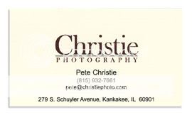
-Pete

-Pete
- Joined
- Apr 9, 2009
- Messages
- 41,401
- Reaction score
- 5,706
- Location
- Iowa
- Website
- kharrodphotography.blogspot.com
- Can others edit my Photos
- Photos OK to edit
^ ^ ^ ^ ^ ^ ^
I was also going to suggest a space between each letter of P h o t o g r a p h y to balance the logo more. The third logo is the most professional.
Be mindful that if the logo is not rendered as a vector file (Adobe Illustrator for example) it's pretty much useless for business use.
I was also going to suggest a space between each letter of P h o t o g r a p h y to balance the logo more. The third logo is the most professional.
Be mindful that if the logo is not rendered as a vector file (Adobe Illustrator for example) it's pretty much useless for business use.
NateWagner
TPF Noob!
- Joined
- Jun 2, 2008
- Messages
- 1,236
- Reaction score
- 0
- Location
- St. Petersburg, FL
- Website
- www.loneoakphotography.com
- Can others edit my Photos
- Photos OK to edit
I actually haven't considered all caps, I do have a version with all caps though, I can add it here a little later. I also have a version in which the tree is to the left of the logo, is smaller and not "eating" the logo.
The newer ones are all vector files that I'm exporting as jpg's for here.
I do like the third one, but again my difficulty is that I would like to be able to separate out the logo such that I could use different parts in different aspects. (for example, in examples 1 and 2 I could just use the tree, or I could just use the words, they stand alone. In 3 it all pretty much has to be together.
Similar threads
- Replies
- 17
- Views
- 1K
- Replies
- 3
- Views
- 134
- Replies
- 6
- Views
- 341
- Replies
- 8
- Views
- 985

