holga girl
TPF Noob!
- Joined
- Jun 17, 2007
- Messages
- 241
- Reaction score
- 0
- Location
- Charm City, MD USA
- Can others edit my Photos
- Photos OK to edit
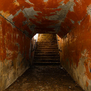
i am torn between the first one and third one....
http://www.smutek.net/new_gallery/d/34-1/jennifer5.gif
any thoughts, suggestions, comments?
thanks!
Jennifer
http://www.smutek.net/new_gallery/d/34-1/jennifer5.gif
any thoughts, suggestions, comments?
thanks!
Jennifer






![[No title]](/data/xfmg/thumbnail/34/34685-17f2466cddc9890af6ca67c65e2e7d5c.jpg?1619736602)
