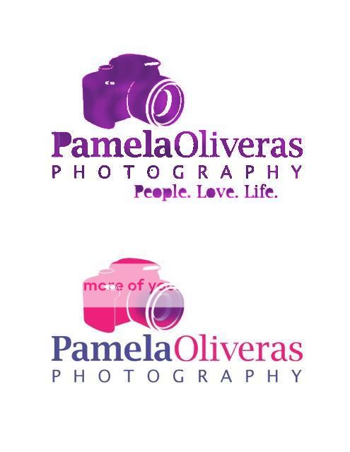
LOGO, what do you think? Thanks :o)

ukreal1

TPF Noob!
Joined
May 12, 2008
Messages
61
Reaction score
0
Location
Okinawa, Japan
Website
www.pamelaoliveras.com
Can others edit my Photos
Photos NOT OK to edit
logo.jpg
 
Very nice - an excellent bit of graphic design! My only concern is that with that shade of pink (and it may just be my horribly uncalibrated work monitor) that there could be an unintentional association with breast cancer.
 
I really like that logo. Did you make it yourself? I like the layout and you still got your people love life in there :)
 
Thanks guys,
no I didn't make it, I wouldn't know where to start. My designer friend hooked me up because I did his wife's maternity photos. The pink has grown on me, it was my idea to have it, then I thought 'I am not sure' but now I like it (I think LOL)...:lmao:
 
It might look better on black...it wont be so bright.

I love creating logos...it so fun :) I spent WAYY too much time making ones for myself.

Im not CRAZY about the pink...but like I said...it may look better if it was on black.
 
I like it -- I'm not loving the pink, because it seems a bit too bright (although even another shade of pink might fix that).

Is the other part purple? If so, then what if you changed the purple parts to black? It may be the interplay between hot pink and hot purple that's so...bright.
 
oh I see, you mean the logo ON black background, not the logo in black, right? It's def. bright I will agree on that LOL
 
I too see it a bit too bright.... perhaps changing the background or the purple parts to black as suggested might make it more easy onthe eyes...

to me...pink and purple just don´t work and are too girlie.. to me.. (I´m not a pink person :p) but if used correctly thay can do wonders.. maybe just different shades....

the overall idea is very nice though

Totally agree.
 
the purple is actually meant to be blue and is showing up blue on my comp, maybe blueishy/purple... I became a pink person a few yrs ago, don't know how, I am not a girlie girl, more like a tomboy! But I do love that hibiscusy pink :eek:)
The other color combo I had been thinking of were all shades of blue, but I thought that was too boring, maybe trow some turquoise in there...he is also making me the package to contain all white and all black...
P
 
It´s not the greatest example... but just a try to imporve the purple...

I mixed black and purple with airbrush... it´s just meant to give an idea of color... just that...so don´t worry it´s splotchy... :p
pamela.jpg
 
oops... sorry for the edit... I just saw you had not ok..I thought I saw ok to edit a lil while ago.... sorry....(although is not a pic but sorry anyway... will just wait for you to see and I´ll take it down)
 
I don't know, I like the original. But I do agree that a darker background would help.

Hey Uk, how's Okinawa? I was there in 1992, Camp Hansen.
 

Most reactions

Back
Top