Looking for a critique..

elizpage

TPF Supporters
Supporting Member
Joined
Jan 2, 2014
Messages
242
Reaction score
62
Location
Atlanta, GA
Website
www.elizabethpagewalker.com
Can others edit my Photos
Photos NOT OK to edit
Just posting to see if I could get a little feedback on a shoot I recently did :) I think I've improved a little since I was last on PhotoForum. Plus, I got some new gear that helped significantly.

I'll in turn provide feedback on images!!

#1: A photo of a 90 year old man on his birthday. I like this one because he has a tiny smile

3.jpg


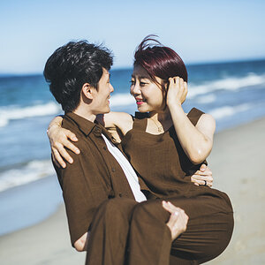
#2: A beautiful family.

19.jpg

#3: Here's one that needs a little work that isn't completely edited yet.. There's just something off about the color temperature.. and I don't really know how to fix it
21.jpg


#4: A beautiful pregnant woman. This one also needs work somehow.. Not that the others don't, but yeah.
9.jpg


#5 : This also needs a substantial amount of work.. These are a pair of proud grandparents. Any suggestions?
IMG_2632.jpg
 
Ok, well don't shoot the messenger mind you.. and this is with my standard caveat that I am neither a portrait photographer or a lawyer and I've never played either on TV...

Photo #1 is smashing. That one I love.

Photo #2, the composition seems just a little off - his right arm is cropped off at the edge of the photo but there is open space between her left arm and her side of the frame.

Photo #3.. Umm.. well, not a big fan. The lighting here isn't great, too much shadow on the subjects, and not really getting much from the background. Moving them in front of one house or the other maybe it would seem a bit more cohesive.

Photo #4 - If you can I'd crop this one just a bit differently, move her out of the center and closer to the right of the frame. The eyes also seem a little flat to be honest. One trick I use sometimes in photoshop, throw a box around the eyes and copy them to a new layer, then reduce the shadows, blend it in with the background layer and merge.

Photo #5 - Again the composition seems a bit off to me, cramped I guess for lack of a better word. I think it's because they both have portions of there arms cut off so it sort of leaves me with the impression they are being forced to squeeze together, sort of throws the emotion I think the photo should convey off a bit.

Ok, so that's it.. quick and dirty. Hopefully some fit will help. If not, hey, I'm just the zoo guy.. lol
 
I think background may be a little busy on some. otherwise nice . just my 2 cents.
 
Ok, well don't shoot the messenger mind you.. and this is with my standard caveat that I am neither a portrait photographer or a lawyer and I've never played either on TV...

Photo #1 is smashing. That one I love.

Photo #2, the composition seems just a little off - his right arm is cropped off at the edge of the photo but there is open space between her left arm and her side of the frame.

Photo #3.. Umm.. well, not a big fan. The lighting here isn't great, too much shadow on the subjects, and not really getting much from the background. Moving them in front of one house or the other maybe it would seem a bit more cohesive.

Photo #4 - If you can I'd crop this one just a bit differently, move her out of the center and closer to the right of the frame. The eyes also seem a little flat to be honest. One trick I use sometimes in photoshop, throw a box around the eyes and copy them to a new layer, then reduce the shadows, blend it in with the background layer and merge.

Photo #5 - Again the composition seems a bit off to me, cramped I guess for lack of a better word. I think it's because they both have portions of there arms cut off so it sort of leaves me with the impression they are being forced to squeeze together, sort of throws the emotion I think the photo should convey off a bit.

Ok, so that's it.. quick and dirty. Hopefully some fit will help. If not, hey, I'm just the zoo guy.. lol

Thanks for this!

I really like Photo #1 as well. I don't have many complaints on that one, actually.. And I'm super critical of my own work.

I will try to crop #2 a bit so that they are even on both sides.. maybe that will help a bit.

Do you think #3 can be fixed at all? It's really just not the best photograph, but they rushed me through things even though I assured them I had plenty of time..

#4, Ah Yeah, now that you mention it I can see that her eyes are a wee bit flat.. Not sure how to do the Merging thing you were talking about though, but I'll figure something out.

#5- They weren't being forced actually, luckily I have several where they are not in that position :)
 
I played a bit with #5. How to share? Post to an image sharing site and use the link?

-added lens blur and slightly lightened and desaturated the background

-cropped in a bit

-smart blurred subjects just a bit

-adjusted grandma's skin tone just a tweak

-slight whitening of teeth (hopefully not to chicklets level).
 
Last edited:
Ok, well don't shoot the messenger mind you.. and this is with my standard caveat that I am neither a portrait photographer or a lawyer and I've never played either on TV...

Photo #1 is smashing. That one I love.

Photo #2, the composition seems just a little off - his right arm is cropped off at the edge of the photo but there is open space between her left arm and her side of the frame.

Photo #3.. Umm.. well, not a big fan. The lighting here isn't great, too much shadow on the subjects, and not really getting much from the background. Moving them in front of one house or the other maybe it would seem a bit more cohesive.

Photo #4 - If you can I'd crop this one just a bit differently, move her out of the center and closer to the right of the frame. The eyes also seem a little flat to be honest. One trick I use sometimes in photoshop, throw a box around the eyes and copy them to a new layer, then reduce the shadows, blend it in with the background layer and merge.

Photo #5 - Again the composition seems a bit off to me, cramped I guess for lack of a better word. I think it's because they both have portions of there arms cut off so it sort of leaves me with the impression they are being forced to squeeze together, sort of throws the emotion I think the photo should convey off a bit.

Ok, so that's it.. quick and dirty. Hopefully some fit will help. If not, hey, I'm just the zoo guy.. lol

Thanks for this!

I really like Photo #1 as well. I don't have many complaints on that one, actually.. And I'm super critical of my own work.

I will try to crop #2 a bit so that they are even on both sides.. maybe that will help a bit.

Do you think #3 can be fixed at all? It's really just not the best photograph, but they rushed me through things even though I assured them I had plenty of time..

#4, Ah Yeah, now that you mention it I can see that her eyes are a wee bit flat.. Not sure how to do the Merging thing you were talking about though, but I'll figure something out.

#5- They weren't being forced actually, luckily I have several where they are not in that position :)

Saving #3 would be tough I think, if it were me I'd probably crop out as much of the background as I reasonably could, then try masking the three people, copy them to a new layer, reduce the shadows as much as you can get away with, then bump up the contrast.
 
I think ape-face pretty much nailed it.

Ya, on the ape face thing, I've really been thinking about changing it.

Got a couple of options.

Monsieur Visage De Gorille. Because, well, chicks dig French.

My other option? Change my name to an unpronounceable symbol and be referred to as the Artist Formerly Known as Ape Face. Not so sure about that one, would be fun to get huffy because no one could pronounce my name but on the downside it would be tough signing checks.

Hmm...
 
Ok, so on the whole how to punch up the eyes a bit topic - this is quick and dirty but hopefully it will give you a good illustration as to what I was taking about. So I talked a cousin into posing for this shot:


As you can see the eyes are pretty heavily shaded, and my cousin has a real thing about using reflectors.. so... off to photoshop we go...


So I load the image into photoshop, and using the rectangular selection tool select the area around the eyes. In the edit menu, select copy, then edit menu again and paste. Photoshop automatically creates a new layer with just that selection on it, so just the area around the eyes.

Then go into the image menu, under adjustments, and select shadow and highlights. Use the slider for shadows to increase or decrease the amount of shadow.


Ok, so now the eyes look better - but to make it look right we need to select the eraser an blend in the new layer with the old by going around the outside and erasing part of the second layer so we can blend it in properly with the first and it looks right:


You can also make other adjustments to this layer, such as vibrance, contrast, saturation, etc - to make the eyes stand out a bit more. Once your done, just merge the new layer with the old one and viola:


Hope that helps.
 
^Priceless.
 
I played a bit with #5. How to share? Post to an image sharing site and use the link?.
I usually just post directly in the thread.
 
When I click the image icon, it asks for a url, so it needs to go to flickr, potobucket, etc first?
 
When I click the image icon, it asks for a url, so it needs to go to flickr, potobucket, etc first?
I think there are several ways to get it uploaded, but one of the simplest is just look at the footer tabs right under your reply. "Upload a file" is right there.
 
Aha! Had blindly missed the 'upload a file' radio button. Thanks, Designer!
Now let me try...
 
IMG_2632.1.jpg
I played a bit with #5. How to share? Post to an image sharing site and use the link?

-added lens blur and slightly lightened and desaturated the background

-cropped in a bit

-smart blurred subjects just a bit

-adjusted grandma's skin tone just a tweak

-slight whitening of teeth (hopefully not to chicklets level).
 
Last edited:

Most reactions

Back
Top