SuperMom30
TPF Noob!
- Joined
- Jul 15, 2008
- Messages
- 66
- Reaction score
- 4
- Location
- fort walton beach florida
- Can others edit my Photos
- Photos OK to edit
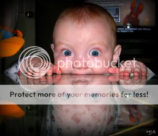
Just looking for some C&C on a few of my photo's. You guys...and gals are such a big help.
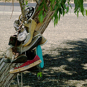
1.
2.
3.
4.
5.
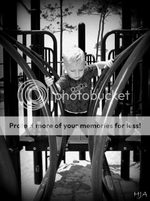
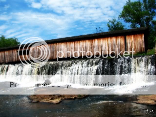
1.
2.
3.
4.
5.

![[No title]](/data/xfmg/thumbnail/36/36601-26ec0a53712c5470af53be9652811a6e.jpg?1619737641)


![[No title]](/data/xfmg/thumbnail/34/34345-5642c495cae8d6c7bb83c28664146cf1.jpg?1619736381)
![[No title]](/data/xfmg/thumbnail/34/34346-f7996f51f0624620cfd54a488abeacf9.jpg?1619736382)