Mariposa - Jewelry Shots

Digital Matt

alter ego: Analog Matt
Joined
Jan 30, 2004
Messages
5,358
Reaction score
73
Location
Santa Barbara, CA
Website
www.mattperko.com
Can others edit my Photos
Photos NOT OK to edit
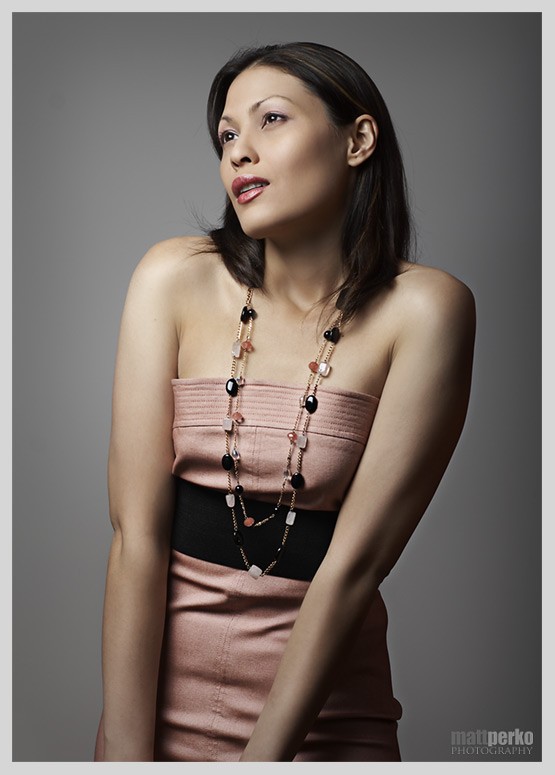
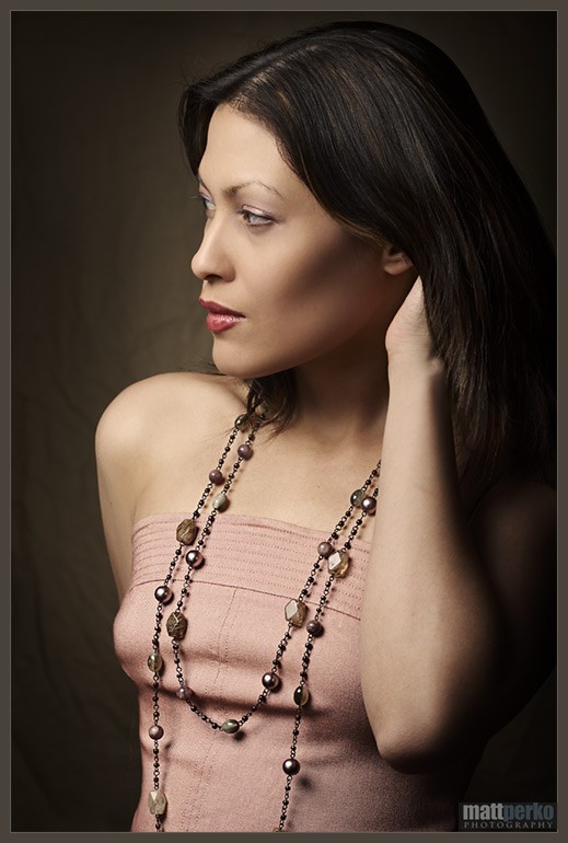
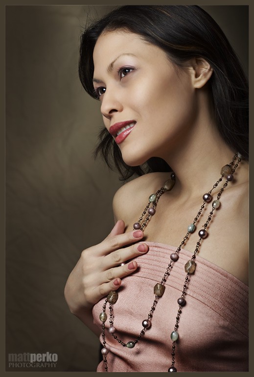
These shots are for a burgeoning jewelry company in Asia called Mariposa.

2319446441_438eed8812_o.jpg


2320156302_890012f4c8_o.jpg


2319291557_3335b2b6cf_o.jpg
 
good shots, but #1 and #2 seem to be more about your wife than about the necklace.

(your problem is: she's waaayyyy better looking than the jewelry..;))


pascal
 
She is very pretty - did you use seamless paper in the first two?
 
Thanks for the replies everyone. Sorry you don't like the jewelry digital flower. I think it's quite nice.

Puscas, I do see your point. I wanted to have some shots that included all of the necklace (which is quite long) I have many other shots that I haven't processed yet, which are closer head shots that show more of the jewelry. Anything specific you would have done differently?

JimmyJaceyMom: The background is a large piece of white foamcore, lit with a snooted strobe.
 
Matt, They're wonderful jewellery shots. They look so polished - just like the magazine photos.

Infact, many jewellery ads are heading away from the close up product shot, and going for the more 'abstract' ad - where someone is just wearing their jewellery.
I saw some great ads for shoes once. They had these nice shoes on these gorgeous girls, but they were lying in bath tubs, and on beaches and stuff... you didn't even notice the shoes but the photos were gorgeous and got your attention - Then - you noticed the shoes.

and well... I still remember those images so must've worked!
 
Thank you Meysha. I concur with what you are saying about jewelry shots. Much of my research in Vogue and InStyle has proven that to be true.
 
Thank you Meysha. I concur with what you are saying about jewelry shots. Much of my research in Vogue and InStyle has proven that to be true.


Yes the magazine's definately have a whole set of other rules than portraiture does. Like acceptable to crops at limbs and such when the focus isn't the person, or shading out a model's eyes completely when the focus is on, say, the lipstick. Hard to get past some of those when certain things are beat into your head. Truly though if you think about it, if the model didn't matter they wouldn't bother finding such goodlooking people to put the items on! The girl brings the attention sometimes, like Meysha was saying and then the jewelry is noticed.
 
I agree with those who said that the model is overshadowing the jewelry, Marge is looking as good as ever.

Well, it's really only an issue for me in the first one, where she is looking at the camera. I read somewhere (and it makes sense to me) that when advertising the clothes or accesories, the model shouldn't be looking at the camera/viewer...but when you're advertising the model, they should be looking at you. Of course, there are no hard rules like that in this type of thing...

Also, I find that the texture of her dress (and the processing) is giving is a sort of gritty look...I find that this does tend to steal some of my eye's attention away from the jewelry.

Overall, it's fantastic work.
 
Thanks Pete. Things have changed around here. I guess I didn't even notice the commercial forum. I assumed it was more for product photos and still lifes. If anyone wants to move it there, feel free.

Mike, thanks for your reply. Your point about eye contact makes perfect sense. I'm doing several shoots for this company, and I'll keep that in mind in the future.

I processed a few more that I'll share.

2322080817_30b2e3972b_o.jpg


2322897810_1f4fb5cc27_o.jpg
 
they are great shots point blank...the model isn't looking at the camera, she is no longer the focal point, your eyes go for the jewelry, just as you wanted. Great work
 
Your quality of work is so good Matt so how do you figure out which one is the "money shot"? Fabulous work you do, bravo bravo!
 

Most reactions

Back
Top