Austin Greene
Been spending a lot of time on here!
- Joined
- Jan 6, 2012
- Messages
- 1,472
- Reaction score
- 855
- Location
- Mountain View, California
- Website
- www.austingreenephotography.com
- Can others edit my Photos
- Photos NOT OK to edit
Got back out to Treasure Island near San Francisco for a shoot yesterday. It was a blast! I'd have several of these shots floating around in my head for over a month now, so it was nice to finally see them become a reality. Plus I had a fantastic model, who didn't mind broken glass everywhere, and heaps of dust. My favorites are #1 and #3
1. My favorite")
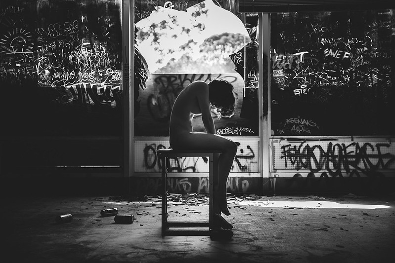 The Artist by
Austin Greene, on Flickr
2.

Armor by Austin Greene, on Flickr
3. Also a favorite
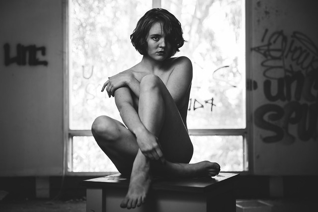
Mary by Austin Greene, on Flickr
1. My favorite
The Artist by Austin Greene, on Flickr
2.
Armor by Austin Greene, on Flickr
3. Also a favorite
Mary by Austin Greene, on Flickr
Last edited:


![[No title]](/data/xfmg/thumbnail/38/38444-6063bb59cb410c520a1ccccbe58db9c7.jpg?1619738614)
![[No title]](/data/xfmg/thumbnail/38/38443-d3f00036791c5f915b132320c9ac8865.jpg?1619738614)