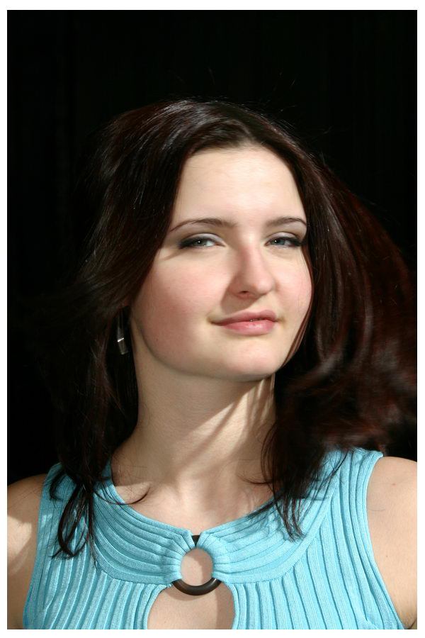
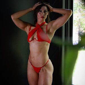
Like the first one. her look is more sugestive. the colors work.
Second one Im not felling. Anyways cant really say what is wrong with the second one. But LOVE the first.
First shot goal was "sexy". The thing is that I used the flash to get rid of the shadows, and my Drebel and Vivitar will only sync at 1/125... and that shutter speed is not high enough to give motion bloor.
First shot goal was "sexy". The thing is that I used the flash to get rid of the shadows, and my Drebel and Vivitar will only sync at 1/125... and that shutter speed is not high enough to give motion bloor.
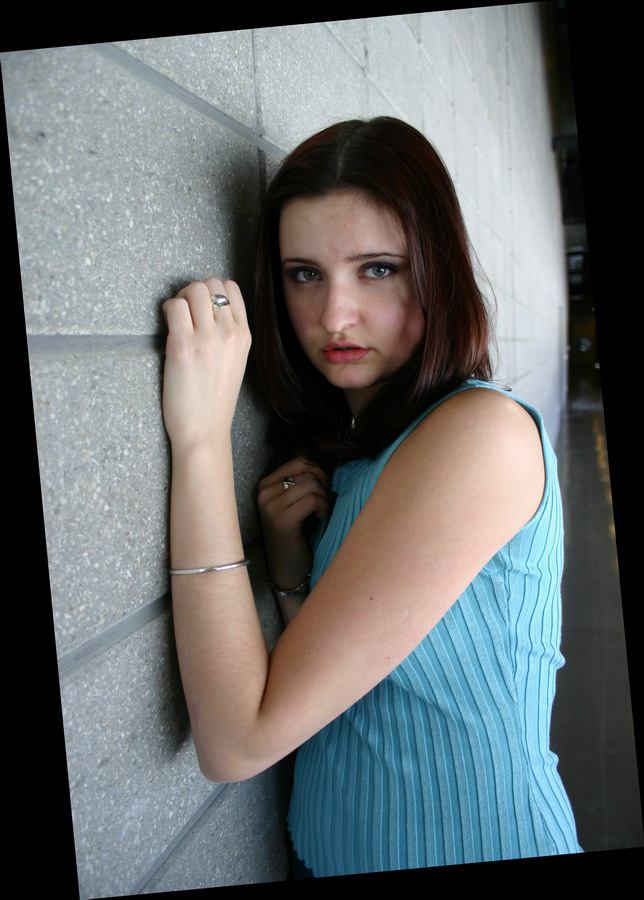
Hey if you were going for scared in the second one, your model is outstanding. She did a very good job. Still I dont like the photo, HOWEVER her expression DOES convey the desired emotion, and the photo captures it. very good show.
The first frame looks like a sexy year book photo. May be a little contrived.
I think you got the shot in the second frame. I question the angled photo in a black frame deal.
I think its the mental image your getting about the fear and aprehension on the models face. If this is true, AND what the photographer was going for, doesnt that make the second picture extremely well done?
Are these scans or digital? They seem out of focus. 1st picture's background doesnt work. 2nd pic i actually like better than the first one, I like the angled frame. But the lighting seems a lil too dark. Theres too many shadows on her face. The pose doent really reflect being scared, that I would say would be more of a shot for seduction, or something you might see in like a biker magazine.
1st pic is motion blurred quite heavily, cause I had to mix flash light with sunlight and that limited me to 125 Tv. You can even see it in the reduced version.
Second one is sharp, it's just the way I compressed it for web.
2nd pic i actually like better than the first one, I like the angled frame. But the lighting seems a lil too dark. Theres too many shadows on her face. The pose doent really reflect being scared, that I would say would be more of a shot for seduction, or something you might see in like a biker magazine.
I think its the mental image your getting about the fear and aprehension on the models face. If this is true, AND what the photographer was going for, doesnt that make the second picture extremely well done?
dont think so. i mean it is well taken, but the model's expression just annoys me. it looks like she is trying way to hard to be sensual or something...but i love the first one.

") but I like the expression
but I like the expression
![[No title]](/data/xfmg/thumbnail/34/34039-a3bf38301d5ee5f8b658c43a86558500.jpg?1619736250)
![[No title]](/data/xfmg/thumbnail/33/33357-bd174890e33fb2a7f7338b9278e6dad2.jpg?1619735920)
![[No title]](/data/xfmg/thumbnail/38/38293-15e3a85f038b239e3c60bf9f38f5d56c.jpg?1619738563)
![[No title]](/data/xfmg/thumbnail/31/31751-fb2f68cca32f9eec468dbde7d649840f.jpg?1619734990)
![[No title]](/data/xfmg/thumbnail/38/38294-cb4a5aa0ded725d4c694e6eebe276f0d.jpg?1619738564)