Megan

ClarkKent

No longer a newbie, moving up!
Joined
Mar 20, 2005
Messages
2,020
Reaction score
9
Location
Kankakee,IL
Can others edit my Photos
Photos OK to edit
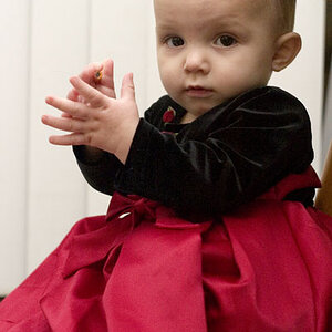
I haven't posted any work for a while, and I figured it was about time. So I am in the very early learning stages of portrait work, and some friends that I used to work with at a Police Station wanted some pics taken of their family. So I decided that it would be good practice, so I gave it a shot. So here is what I came up with.
fg.jpg
 
i love the color and tones but i feel the vignetting is too strong. it's also a tad underexposed and it looks "8x10'd", like you were forced to crop it so you lopped off her feet and the space abover her head. getting in closer would probably be a good idea in this case. Take this comment with a grain of salt, since i dont know much about posing, but her pose seems a bit....awkward...and she's a bit too centered (for my tastes). overall a nice photo though, the presentation looks quite refined!
 
The strength of the vignetting doesn't bother me, but the fact that her face is in the vignette does. Also, it is underexposed, and I would like to see her feet in the shot...otherwise, I do like it. The pose doesn't bother me at all. Nice job! Got others you can show us?
 
thebeginning said:
i love the color and tones but i feel the vignetting is too strong. it's also a tad underexposed and it looks "8x10'd", like you were forced to crop it so you lopped off her feet and the space abover her head. getting in closer would probably be a good idea in this case. Take this comment with a grain of salt, since i dont know much about posing, but her pose seems a bit....awkward...and she's a bit too centered (for my tastes). overall a nice photo though, the presentation looks quite refined!

Yes....I was just trying to put something together real quick before I had to leave for Camera Club, And I was having trouble getting the uploaded picture to match the on-screen photo in photoshop. When I uploaded the picture here it looked really washed out...so I guestimated on the darkness adjustments. Good pointers though.....all of which I need to learn!
 
Great area! The lighting is a bit too "from above," setting her eyes back. I agree, the crop can be improved. When you're this close to showing her feet, either show 'em, or crop up to 3/4 legnth. The vignetting is fine, providing (as stated by Corry) it doesn't creep onto her face. I would like to see the hands posed differently, positioned apart and near the hips. Do you have a tad more space above the head on the original file?

Nice work!

-Pete
 
Clark,

I love the location, and the vignetting (except where it intrudes into her face). You have her turned properly and the crossed front leg adds a nice slenderizing touch to her legs and hips, and a nice slight head tilt. (She needs feet).

The lighting. As already mentioned she has the dreaded 'raccoon eyes' in this image. An off camera D/C powered flash in an umbrella or small softbox off to camera left would have given this portrait a nicer lighting pattern.

The pose. She has what I call the 'I gotta pee' pose. What if you would have backed her into the tree, placed her left foot under her buns and leaned her away from the camera a bit, then posed her left hand on the top of her upraised left leg, and her right hand in the right front pocket or her thumb in her right front pocket.

TH
 
A couple more from the same shoot.
Number-two.jpg

Mom-and-Dad1.jpg
 
I like the pose in the top one..she looks sweet but I agree with daniels comments. It needs a definite contrast boost and some sharpening. I think there's too much space on her left side. It's ok where you cut off her legs...you just don't want to chop them at the knee.
The last two you posted are naturally posed and well composed overall.
Nice work and a nice feel to these shots. :D
 

Most reactions

New Topics

Back
Top