Messing around with my son

camz

No longer a newbie, moving up!
Joined
Jun 11, 2009
Messages
1,878
Reaction score
285
Location
Bay Area
Can others edit my Photos
Photos NOT OK to edit
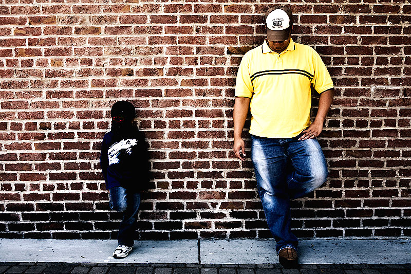
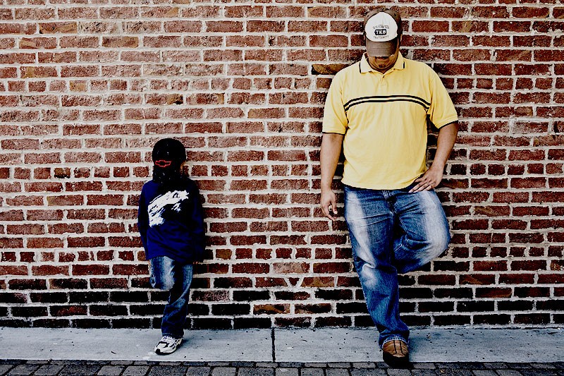
So we came across this brickwall in downtown Pleasanton, CA. We noticed it walking along Main St and as soon as I saw it, thought that it was an urban shoot mecca. The bricks had all kinds of cracks, different tones, dirt...you name it. It was rustic and had alot of character. The beauty is that both sides of the building has the similar brick finish forgiving enough that if the sun's harsh lighting was on one side, you have the option of shooting on the other. So my son and I messed around and possed and this was I think the most symetrical shot we can get that turned out decent. Very exciting thinking about bringing clients here to do a session :D

3810299777_7aba7fc9ec_o.jpg
 
Last edited:
Much to rough, I don't dig it. Colors are rich with good contrast but it looks over sharpened. Is your son wearing is cap backwards, because at first it just looked weird.
 
Well thats an awkward title. . .heh.

In any case while I don't find the treatment rough, it is way too contrasty. I THINK I like where you were going with this, but it seems to have been pushed beyond that boundary.

Give us a look at the original?
 
Much to rough, I don't dig it. Colors are rich with good contrast but it looks over sharpened. Is your son wearing is cap backwards, because at first it just looked weird.

He's actually wearing his hat forwards. Maybe it's because he was looking down and his clothes were dark to where the lines all blended(it is hard to tell what he's doing). As far as the sharpening I reduced it to 535x800 then sharpened, think that was my mistake and didn't smart sharpen. I think I was more excited on how the brick wall looked instead of the subjects. Thanks for the comments.

Well thats an awkward title. . .heh.

In any case while I don't find the treatment rough, it is way too contrasty. I THINK I like where you were going with this, but it seems to have been pushed beyond that boundary.

Give us a look at the original?
LOL..i'm not going to even comment on your thoughts about the title

So it's the inverse for you? The intention was to match the rustic look of the brick wall. When I get home and process versions with less contrast and less sharpeness. Thanks!
 
So here's something in between. Not sharpened as much with less contrast compared to the original image. Still trying to achieve the rustic
look.
3813024191_b4c9308536_o.jpg
 
Personally I think the first one would look good as a print ( matte).. 2nd one u got some white specs on ur kids cap I guess u forgot to brush over.
 
good observation! The white spots are actually part of the hat...it's part of the design that makes the hat look old and worn out. On the fist version I went with more contrast and I think that's why it isn't as significant.
 

Most reactions

New Topics

Back
Top