
Jon_Are
TPF Noob!
- Joined
- May 12, 2007
- Messages
- 655
- Reaction score
- 13
- Can others edit my Photos
- Photos NOT OK to edit
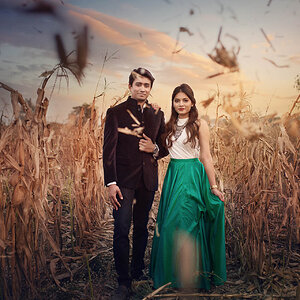
I know I'm late to the party, but I really love #2. The colors are gorgeous, the shadows add to the image, and the lines (of the trees, horizon, 'fake' horizon, etc.) create a sense of depth and perspective.
Most of the rest are too saturated for my taste.
Good luck!
Jon
Most of the rest are too saturated for my taste.
Good luck!
Jon

![[No title]](/data/xfmg/thumbnail/32/32163-b5a5e5cde131a9d14df7f164ab9cb8ab.jpg?1619735234)
![[No title]](/data/xfmg/thumbnail/41/41798-aacfc8368463d919cba743fe318706b6.jpg?1619739897)
![[No title]](/data/xfmg/thumbnail/40/40284-f59f6230f0d5b9eacf977f8b0392f087.jpg?1619739407)
![[No title]](/data/xfmg/thumbnail/39/39511-592cbd68b1d797ffce7e41e4fbfed890.jpg?1619739066)
![[No title]](/data/xfmg/thumbnail/32/32162-dd2cfb373402c59de9c6f13cee73b0fb.jpg?1619735234)
![[No title]](/data/xfmg/thumbnail/33/33440-0778f3522902634844facab43c5a29fa.jpg?1619735969)
![[No title]](/data/xfmg/thumbnail/39/39509-3c2c5856429b4b8ff3cf44cd3b2afa8c.jpg?1619739064)

![[No title]](/data/xfmg/thumbnail/32/32161-a5da499a329f1fae945778aac75d4442.jpg?1619735234)