Navigation
Install the app
How to install the app on iOS
Follow along with the video below to see how to install our site as a web app on your home screen.

Note: This feature currently requires accessing the site using the built-in Safari browser.
More options
You are using an out of date browser. It may not display this or other websites correctly.
You should upgrade or use an alternative browser.
You should upgrade or use an alternative browser.
ModernClassic
- Thread starter zivlai
- Start date
mysteryscribe
TPF Noob!
- Joined
- Feb 1, 2006
- Messages
- 6,071
- Reaction score
- 3
- Location
- in the middle of north carolina
- Website
- retrophotoservice.2ya.com
- Can others edit my Photos
- Photos OK to edit
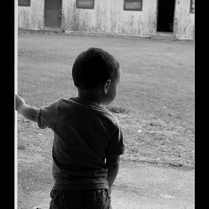
I definitely like your first one best. It could have been cropped tighter for me but I like it a lot. The others are technically done well but if you crop the first one like the last oen you have the real winner in my opinion. And crop out that bend in the wall.
Since I'm not sure you allow edits let me try to explain. I would crop so that her eyes are the on the top third line of the image. On the right just a tiny bit into the fan out of the crop area, at the bottom above the bent elbow to get it in proportion. On the right all of her shoulder in the image area. In other words turn it into a head and shoulders cutting out most of the background completely.
Since I'm not sure you allow edits let me try to explain. I would crop so that her eyes are the on the top third line of the image. On the right just a tiny bit into the fan out of the crop area, at the bottom above the bent elbow to get it in proportion. On the right all of her shoulder in the image area. In other words turn it into a head and shoulders cutting out most of the background completely.
CrazyAva
TPF Noob!
- Joined
- Mar 14, 2004
- Messages
- 727
- Reaction score
- 1
- Location
- Southern California
- Website
- www.avapadgett.com
- Can others edit my Photos
- Photos OK to edit
Very nice, I like them.
fstop23
TPF Noob!
- Joined
- Jan 24, 2007
- Messages
- 112
- Reaction score
- 0
- Location
- St. Petersburg, Fl
- Can others edit my Photos
- Photos NOT OK to edit
the backlighting on the hair in the last one is great
zivlai
TPF Noob!
thx for advise 
schumionbike
TPF Noob!
- Joined
- Mar 9, 2007
- Messages
- 1,083
- Reaction score
- 0
- Location
- Houston, Texas
- Can others edit my Photos
- Photos OK to edit
Nice job!!, I like the first one and the last one the best.
geminigrl24
TPF Noob!
- Joined
- Jun 13, 2007
- Messages
- 67
- Reaction score
- 0
- Location
- Pleasanton California
- Can others edit my Photos
- Photos OK to edit
I love #1. Great job.
Similar threads
- Replies
- 14
- Views
- 566
- Replies
- 6
- Views
- 412


![[No title]](/data/xfmg/thumbnail/33/33361-f56184027ce743b2b7ba9d378a8bb426.jpg?1619735925)

![[No title]](/data/xfmg/thumbnail/34/34115-73b827c6a6db1413dcead11e4caaae69.jpg?1619736285)
![[No title]](/data/xfmg/thumbnail/31/31095-2b52a6dcc956382cffdd384ae4d156f2.jpg?1619734612)
![[No title]](/data/xfmg/thumbnail/35/35667-929554d4a99c11e00cc6fb65672d03e0.jpg?1619737090)
![[No title]](/data/xfmg/thumbnail/31/31094-f975d7e61424996edc28cec3b9dd70a8.jpg?1619734611)
![[No title]](/data/xfmg/thumbnail/34/34116-b81991a4a8a532509a981cadbacd573c.jpg?1619736286)
