Mono Lake at Sunrise (HDR)

Which one do you like best? Which one should I promote more?

  • Pic 1

    Votes: 11 44.0%
  • Pic 2

    Votes: 8 32.0%
  • Pic 3

    Votes: 6 24.0%

  • Total voters
    25

CraniumDesigns

TPF Noob!
Joined
Dec 1, 2008
Messages
477
Reaction score
2
Location
San Francisco Bay, CA
Website
www.stevendavisphoto.com
Can others edit my Photos
Photos OK to edit
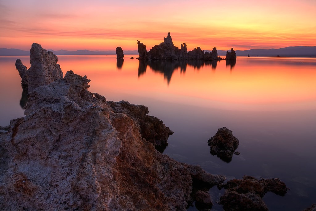
Hey folks! So I went on a little 2 night road trip by myself, sleeping in my car, to the Mono Lake/Bodie area. Here's 3 sunrise pics I took on Wednesday. These are all HDR, merged from -2,-1, and 0 exposures.

Lemme know which one you like best.

Also, I am aware of the odd color blocks in the skies. If anyone could tell me why Photomatix did that in the tonemapping process, that would help greatly.

3816985156_cdf83c245c_b.jpg


3817444559_780d220dd6_b.jpg


3820575341_9a79165290_b.jpg
 
Last edited:
Hah i see your rocks also get the fossilized treatment from HDR as mine. Very nice pics. the only nit-pick i'm seeing in in the 1st and 3rd pics is the orange patch of sky at the back of the frames. other than that the rocks, reflections looks very cool. I've tried doing sunrises/sunsets and those didn't turn out as good as yours
 
Gotta go with number 2. The large rock in the others just doesn't look right to me. Though the sky in #1 is definitely my favorite.
 
I love these pictures! The only thing I could possibly suggest on improving them is raising the contrast just a tad. It'll define the colors more and make a dramatic picture. Other than that, awesome shots! :D
 
There's an HDR Forum?? That's awesome!! Now I can just stay out of it and hopefully never hear about HDR again.

As for the pics, I would have to say that I'm kind of not a fan of the Rocks in the foreground. I feel like it just doesn't add anything to the image. I think the lighting on them is just to flat and blah. They don't stand out and take up way too much of the frame to not be an interesting part of the image. I would have zoomed in to crop them righto out. Then you would just have the rocks further our, with their reflection in the water, and the pretty sky.
 
nice looking images!
you do have some serious banding going on in the sky on these...perhaps some adjustment in photomatix would remedy?
 
There's an HDR Forum?? That's awesome!! Now I can just stay out of it and hopefully never hear about HDR again.

As for the pics, I would have to say that I'm kind of not a fan of the Rocks in the foreground. I feel like it just doesn't add anything to the image. I think the lighting on them is just to flat and blah. They don't stand out and take up way too much of the frame to not be an interesting part of the image. I would have zoomed in to crop them righto out. Then you would just have the rocks further our, with their reflection in the water, and the pretty sky.

personal preference, but thanks. i like to have foreground elements in my shots to add depth. it felt flat and empty with just the rocks in the water.
 
Surprised people are voting more for 1. I think they're all nuts.

3 is the way to go.

The rock formation thingy on the right surrounds and embraces and frames the rock thingy in the distance. In #1 it's more of a distraction. In #3 it focuses your eye on the distance thingy. WAY better.

Very nice colors.
 
Yeah I agree, the photo of the actual sunset is much nicer than a sign that says "Flickr: Picture unavailable :p"

I voted 2. Number 3 is a bit constraint for my liking. The foreground steals attention away form the wonderful sunrise making it a very different picture.


Btw kudos to you. A HDR which looks good and doesn't destroy the image is rare.
 
fixed the color blocks in the sky. turned down the "highlight smoothing" to fix that.

also ran the noiseware plugin on the skys and reflections to reduce the noise created from the HDR process.
 

Most reactions

New Topics

Back
Top