Navigation
Install the app
How to install the app on iOS
Follow along with the video below to see how to install our site as a web app on your home screen.

Note: This feature currently requires accessing the site using the built-in Safari browser.
More options
You are using an out of date browser. It may not display this or other websites correctly.
You should upgrade or use an alternative browser.
You should upgrade or use an alternative browser.
More pics you should comment on!!
- Thread starter kate21
- Start date


bigboi3
TPF Noob!
- Joined
- Apr 1, 2009
- Messages
- 599
- Reaction score
- 6
- Location
- Pittsburg, CA
- Can others edit my Photos
- Photos NOT OK to edit
I think 3 is the best.
bigtwinky
No longer a newbie, moving up!
- Joined
- Oct 6, 2008
- Messages
- 4,821
- Reaction score
- 286
- Location
- Montreal
- Website
- www.pierrebphoto.com
- Can others edit my Photos
- Photos NOT OK to edit
The only one I find interesting is 3
1 is too centered and has lots of odd distracting shadows
2 looks like you accidently snapped a photo when you didn't want to. The subject matter isn't interesting
4 is again very shadowy and way too tilted for my taste. Tilt is fine but don't make the viewer feel like he is falling off the frame
1 is too centered and has lots of odd distracting shadows
2 looks like you accidently snapped a photo when you didn't want to. The subject matter isn't interesting
4 is again very shadowy and way too tilted for my taste. Tilt is fine but don't make the viewer feel like he is falling off the frame
paulk_68
TPF Noob!
- Joined
- Feb 14, 2009
- Messages
- 229
- Reaction score
- 0
- Location
- New York
- Website
- paulkphotos.com
- Can others edit my Photos
- Photos NOT OK to edit
#1) Is an overexposed picture of a headless kid holding strawberry blossoms. What was the point of taking this picture? Please give your answer some thought, the question was not meant to be mean.
#2) Is a slightly overexposed picture of a bodiless kid with a strawberry on top of her head. Again, what was the point of taking the picture?
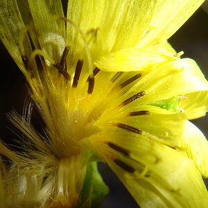
#3) Is actually composed well. I would like it more if it was a little sharper, and if it had a more interesting subject in place of the strawberry blossoms.
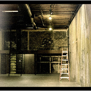
#4) Over-tilted images uke: are as bad as selective color.
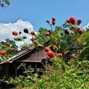
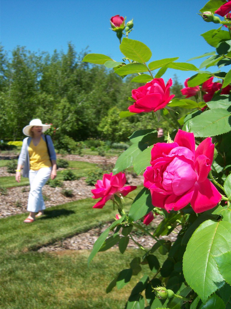
#5) Is over exposed and with the woman walking through the frame, it is hard to tell what the subject is,.. or just distracts from it. The head without a body in the flowers is also distracting.
The title of this thread) "More pics you should comment on" will probably have the opposite reaction that you were hoping for, even though 3 people have already commented.
#2) Is a slightly overexposed picture of a bodiless kid with a strawberry on top of her head. Again, what was the point of taking the picture?
#3) Is actually composed well. I would like it more if it was a little sharper, and if it had a more interesting subject in place of the strawberry blossoms.
#4) Over-tilted images
uke: are as bad as selective color. #5) Is over exposed and with the woman walking through the frame, it is hard to tell what the subject is,.. or just distracts from it. The head without a body in the flowers is also distracting.
The title of this thread) "More pics you should comment on" will probably have the opposite reaction that you were hoping for, even though 3 people have already commented.
kate21
TPF Noob!
- Joined
- Jun 21, 2009
- Messages
- 50
- Reaction score
- 0
- Can others edit my Photos
- Photos NOT OK to edit
these were a few of my photos that i wanted to get some input and advise on...
i am glad you told me what you thought about them...i didnt take it as you being mean, please comment on the photos i post in the future, its very helpful
i am glad you told me what you thought about them...i didnt take it as you being mean, please comment on the photos i post in the future, its very helpful
Dagwood56
No longer a newbie, moving up!
- Joined
- Jul 19, 2007
- Messages
- 3,025
- Reaction score
- 491
- Can others edit my Photos
- Photos NOT OK to edit
I'm sorry, I usually don't give harsh C&C, but i don't find any of these shots to be interesting or even appealing -what is the point behind any of them? Headless people? If you shot the first two with the intent of shooting the flower in the childs hand and in her hair then you should have zoomed in much closer to the flower and composed the shots accordingly. The boards and the flower ---perhaps in B&W..... The pathway would have been nice had you shot it from the right or the left -even straight on, but tilted like it is makes no sense at all. And I'm assuming the rose was supposed to be the subject of the last shot so as I mentioned before, you should have zoomed in closer to the rose, or at least waited till the woman [who is to out of focus to appreciate] was out of the frame. Keep trying and perhaps you would benefit from Bryan Petersons book - "Learning To See Creatively"
AtlPikMan
TPF Noob!
- Joined
- Oct 3, 2007
- Messages
- 463
- Reaction score
- 1
- Location
- Atlanta, Ga
- Website
- www.soulsticephotography.net
- Can others edit my Photos
- Photos NOT OK to edit
I agree with the post from above. Ive viewed a bunch of post from new photographers on this forum. I think one of the most important parts of taking a good pic is composure. My advice is when viewing threads from more experienced shooters take more time to study their shot. Pay attention to what makes their shot.
The Bryan Peterson book is a good read, also.
The Bryan Peterson book is a good read, also.
MBasile
TPF Noob!
- Joined
- Apr 30, 2008
- Messages
- 362
- Reaction score
- 3
- Location
- Sunnyvale, CA
- Website
- www.matthewbasile.com
- Can others edit my Photos
- Photos NOT OK to edit
The only one I find interesting is 3
1 is too centered and has lots of odd distracting shadows
2 looks like you accidently snapped a photo when you didn't want to. The subject matter isn't interesting
4 is again very shadowy and way too tilted for my taste. Tilt is fine but don't make the viewer feel like he is falling off the frame
My sentiments almost exactly, except I think "interesting" is a stretch too.
lordtris
TPF Noob!
- Joined
- Jun 24, 2009
- Messages
- 39
- Reaction score
- 17
- Location
- columbus ohio
- Can others edit my Photos
- Photos OK to edit
I really like the way number three looks.
iflynething
TPF Noob!
- Joined
- Oct 26, 2006
- Messages
- 1,346
- Reaction score
- 0
- Location
- South Carolina USA
- Can others edit my Photos
- Photos OK to edit
I'd work on composition. First thing I thought when I saw the first picture was "What the hell"
Then I saw the second one and thought, "Seriously"
I'm trying to find what was the point in taking these pictures....I don't even find 3 interesting at all. It might prove the rule of thirds or show a good example, otherwise......
1) As said, a headless kid holding a flower, nothing else I see from it. I go straight to the stain on his/her thumb
2) There's a flower in there? I see the head that fills almost all of the frame. If you're going to shoot a flower in someone's head, make sure it's not lost in the hair (make it a bigger flower)
3) It's a flower on wood....I dont' have anything to say about it.
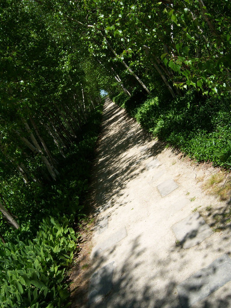
4) Might be nice if it wasn't slanted. Actually, it it was straight and the walkway was offset to the left or right just a tad, it would be wonderful.
5) Nice shot of the flower and good use of rule of thirds but did you see the lady in the background BE AWARE OF YOUR SURROUNDING!!! If you can see something coming into frame, by the time you take the picture, that WILL be in the frame and will probably take away the original concept of the image.
Take this advice or leave it, but I have nothing to work with with these photos
~Michael~
Then I saw the second one and thought, "Seriously"
I'm trying to find what was the point in taking these pictures....I don't even find 3 interesting at all. It might prove the rule of thirds or show a good example, otherwise......
1) As said, a headless kid holding a flower, nothing else I see from it. I go straight to the stain on his/her thumb
2) There's a flower in there? I see the head that fills almost all of the frame. If you're going to shoot a flower in someone's head, make sure it's not lost in the hair (make it a bigger flower)
3) It's a flower on wood....I dont' have anything to say about it.
4) Might be nice if it wasn't slanted. Actually, it it was straight and the walkway was offset to the left or right just a tad, it would be wonderful.
5) Nice shot of the flower and good use of rule of thirds but did you see the lady in the background BE AWARE OF YOUR SURROUNDING!!! If you can see something coming into frame, by the time you take the picture, that WILL be in the frame and will probably take away the original concept of the image.
Take this advice or leave it, but I have nothing to work with with these photos
~Michael~
kundalini
Been spending a lot of time on here!
- Joined
- Jul 18, 2007
- Messages
- 13,607
- Reaction score
- 1,937
- Location
- State of Confusion
- Can others edit my Photos
- Photos NOT OK to edit
Why?More pics you should comment on!!
What do you think that needs critique on? Self assesment is the first layer, so I guess this has passed the test. Now you want others to consider your photos. But have they really passed your sniff test? I don't mean to be cruel, only realistic. If you honestly wanted true comments on these, you wouldn't have posted them, apart from #4 & 5... please number them in the future. The first three are snapshots at best and should remain in your shoe box of fond memories. There's nothing wrong with them in that nature of capturing moments of your childs life, but they should not be up for C&C either. C&C should be used as a tool to improve upon your photographic journey, not a pat on the back.
With that being said, I think the last image is your strongest. The focus is good, the DoF is good, the ROTs is good. However, from looking at the highlights and shadows, you chose the harshest time of day to take this photo.
Just my 2¢.
SonnarSphere
TPF Noob!
- Joined
- Jun 17, 2009
- Messages
- 122
- Reaction score
- 0
- Can others edit my Photos
- Photos NOT OK to edit
hi kate
i like 3/4/5.
3 - i like the elements in the composition. the flower, the wood,
the light on the wood, the color tone.
4 - the angle of the shot. the point of view, the scene.
5 - the counterpoint between the flowers and the candid of the lady,
the slightly unreal color tone/saturation.
i like #3 best of all.
i can understand a theme of 'a story of the flower' in the first three.
some comment for you! :0)
Most reactions
-
 402
402 -
 310
310 -
 274
274 -
 270
270 -
 265
265 -
 215
215 -
 195
195 -
 181
181 -
 166
166 -
 153
153 -
 139
139 -
 139
139 -
 134
134 -
 122
122 -
 104
104