bryanwhite
TPF Noob!
- Joined
- Nov 19, 2006
- Messages
- 102
- Reaction score
- 0
- Location
- Portland, OR
- Can others edit my Photos
- Photos OK to edit
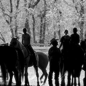
You will see all of the following images. You will see all of the following images. You will see all of the following images. We will not have another Fiasco of the Cows. :er:
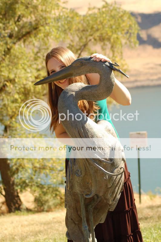
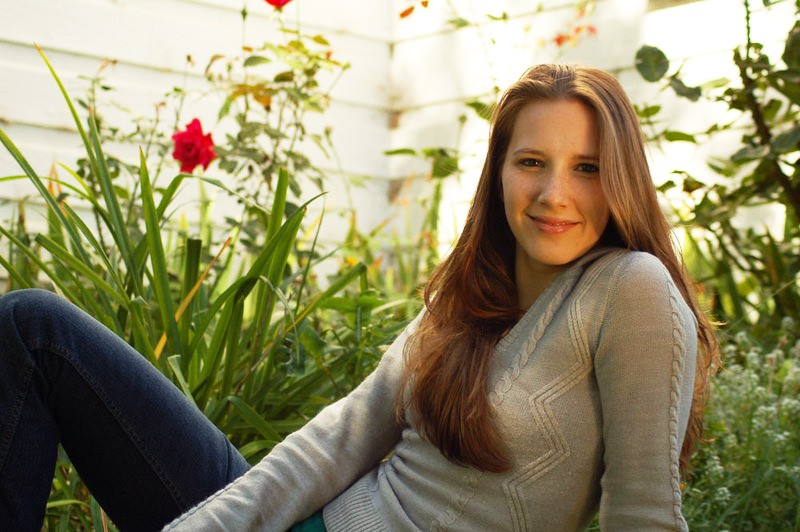
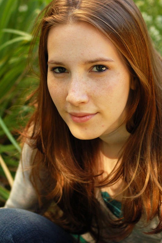
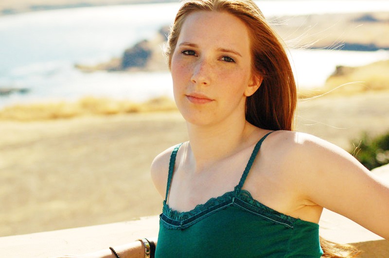
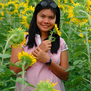
This is my second portrait shoot, this time with Andria (Tara, the other young lady I posted, Tara, was my first). Andria and her mom were impressed with my work with Tara, and were hoping to get similar quality.
This shoot was a bit complicated for me. First, the sun was beating down like nothing else in Maryhill, Washington that day. We were on a time contraint as Andria was at a family reunion, I had a day off, and that was the only way we could get together to do these portraits.
Other than the lighting, which I know now how to do better, I would love your opinions. Mind you, it's quite a few photos I submit for your perusal.
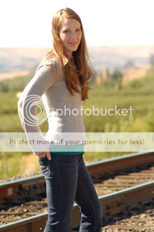
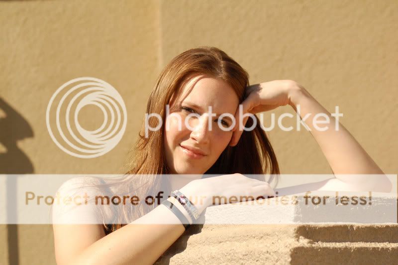
1)

2)

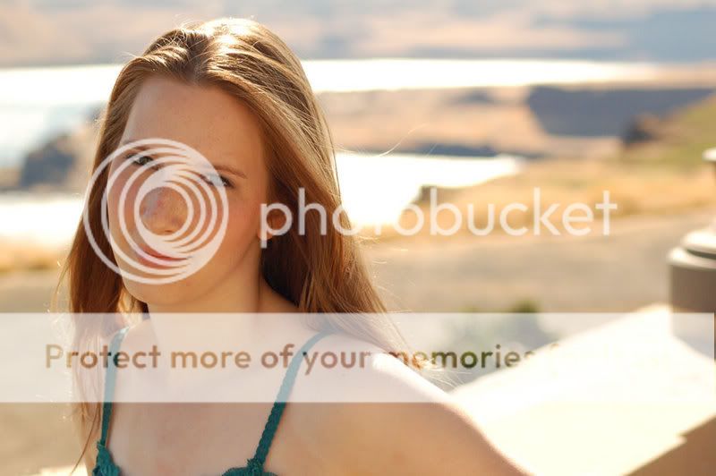
3)

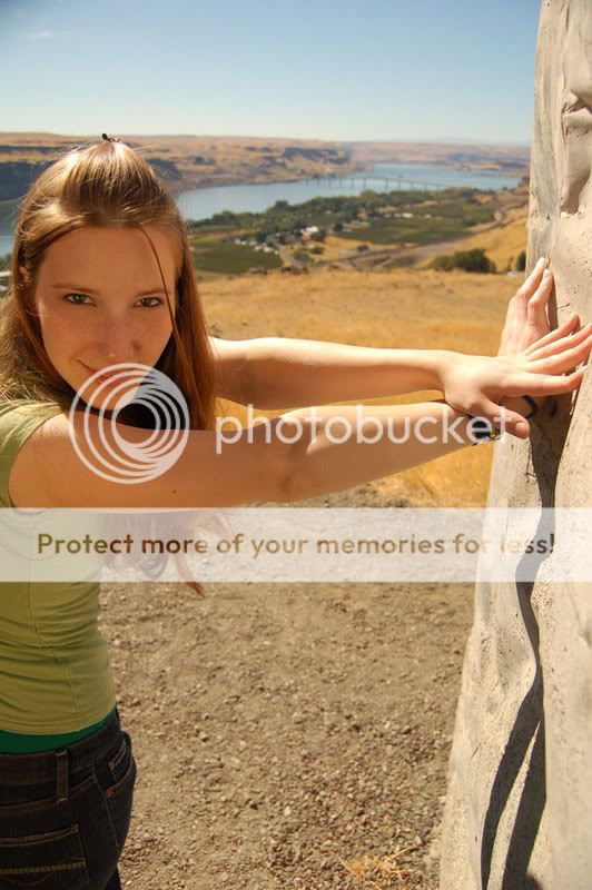
4)

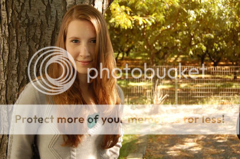
5) On this one, the shadows were a bit harsh. Should have used some fill
6)
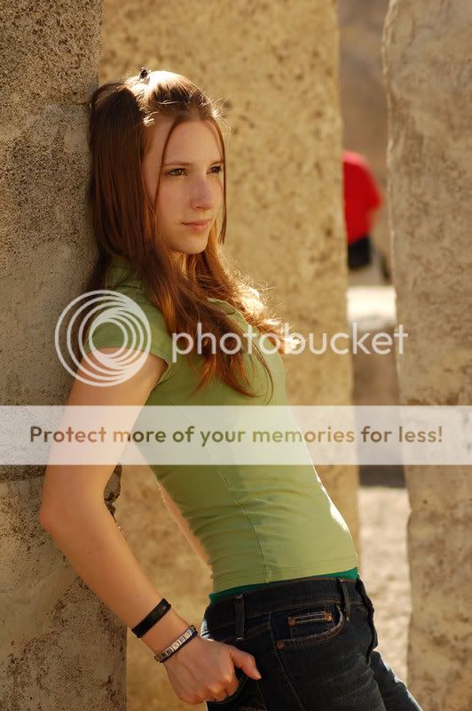
7) On 7 9, I was disappointed to have a guy in a red shirt in the background. He just would not move! I need to learn how to Photoshop him out of these.

8 )

9)
10)

11)

12)

13)
14)
15) The background is an old mansion. I wish it wasnt skin tone
16)

17)
18)

19)

20)
21)
22)

What did I do well, and what would you improve?
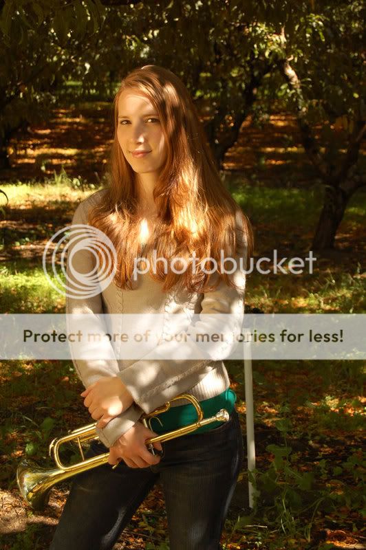
This is my second portrait shoot, this time with Andria (Tara, the other young lady I posted, Tara, was my first). Andria and her mom were impressed with my work with Tara, and were hoping to get similar quality.
This shoot was a bit complicated for me. First, the sun was beating down like nothing else in Maryhill, Washington that day. We were on a time contraint as Andria was at a family reunion, I had a day off, and that was the only way we could get together to do these portraits.
Other than the lighting, which I know now how to do better, I would love your opinions. Mind you, it's quite a few photos I submit for your perusal.
1)
2)
3)
4)
5) On this one, the shadows were a bit harsh. Should have used some fill
6)
7) On 7 9, I was disappointed to have a guy in a red shirt in the background. He just would not move! I need to learn how to Photoshop him out of these.
8 )
9)
10)
11)
12)
13)
14)
15) The background is an old mansion. I wish it wasnt skin tone
16)
17)
18)
19)
20)
21)
22)
What did I do well, and what would you improve?

")