Mountain study. 4k resolution

sarrasani

No longer a newbie, moving up!
Joined
May 15, 2009
Messages
103
Reaction score
40
Location
N/W Italy
Website
www.youtube.com
Can others edit my Photos
Photos NOT OK to edit
Monte Rosa: Lyskamm and Castore glacier (italian side).

Thank you and all the best,
Sandro

_DSC6531_DxO.jpg


_DSC6532_DxO.jpg
 
Agree with weepete -- love the color version, it works much, much better.
 
The B&W one would look much better if you play with the S curve or work with each colour layer ... as I keep saying, it looks flat.
 
Only 4K resolution?
What camera are you using?

I agree the B&W is really monotone instead of B&W and it is way short on mid-tone contrast.
The lack of mid-tone contrast is hindering the perceived sharpness of the photo.
 
Last edited:
Only 4K resolution?
What camera are you using?

I agree the B&W is really monocolor instaed of B&W and it is way short on mid-tone contrast.
The lack of mid-tone contrast is hindering the perceived sharpness of the photo.

I see here about all smaller images, than this your "only" is curious......
here i used a 36 mp camera (Sony a7r). I use to prepare, see and evaluate my jpgs at 4K resolution, then this is my
"target" file and I like to present them so.

About the "lack of mid tone".....ok, but I like to preserve detail (and I think it's good, or not, in the 4k visualization?) but without that kind of harsheness and dry/simplifying strong contrast of many digital images we see.
Then I like (for this kind of "old-fashioned-but-detailed-image-warm-toned" to increase micro-contrast holding, or subtracting something as here, some points to general contrast. Half tones are imho more important......
My reference is Large format film and prints worls, and I try to stay near to that world (I too use really LF cameras, but with digital I have less weight to carry on my shoulders.....:02.47-tranquillity::1247:

Thank you and all the best,
sandro
 
The B&W one would look much better if you play with the S curve or work with each colour layer ... as I keep saying, it looks flat.
thank you much.
as I told in another reply, my reference images in this kind of photography (LF film....) have soft general contrast
in conjunction with rich transitions and natural detail. I used S and single colour control, but having this target.
Also my LF analogue prints were considered "soft", the problem is probably of mine.....:1251: 
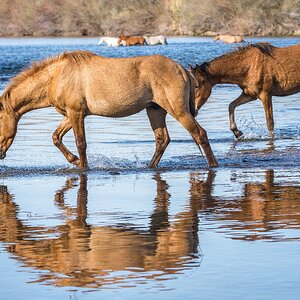
or it's a simple question of tastes.
Again thank you and all the best,
sandro
 
Ah, I understand ... if you printed like that, then I can see why you would see the digital image in the same way.
When I was shooting LF, I liked high contrast type images ... though I did play with zones a lot so my prints had "punch" but still had mid-tones.
 
Again thank you. Happy to read you make/made LF (prints from big films) prints.
IMHO great school, and the tones subtleness and extension of an Ansel Adams prints has IMHO no equal
in modern ink-jet prints........but in my little corner I enjoy much also (and more, more easy.....) the digital shooting.
Especially, and really more since the 4k displays (I use a cheap Panasonic LED 55') and these mirrorless that are similar to little LF cameras (the magnification instead of the loupe.....).
All the best,
Sandro
 

Most reactions

Back
Top