
y0aimee
TPF Noob!
- Joined
- Nov 24, 2009
- Messages
- 131
- Reaction score
- 0
- Location
- San Diego, CA
- Website
- www.facebook.com
- Can others edit my Photos
- Photos NOT OK to edit
I'm taking my very 1st film photography class this semester and I just wanted to share with everyone my progression and the prints I developed on my own. I will update & post new pics each time I finish a print(s).
Oh, and I have to take pics of my prints because I don't have a scanner. =/ I know, I know.. ghetto. LOL. I tried my best to keep the pics exactly the same as my prints.. so excuse the double picture effects which turn out flat. I'll get around to using the scanner at school once I get the chance. Sorry.
Camera: Nikon FE 35mm slr
Film: Ilford HP5 plus 400 b&w
Paper: Ilford multigrade FB
C&C is always welcome!
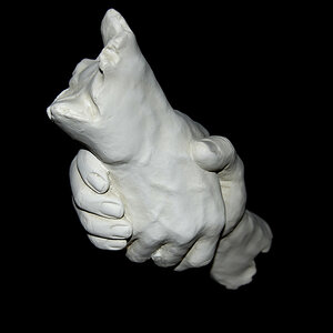
1 3 separate prints here

2

3

4

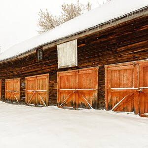
5 i really like this one.

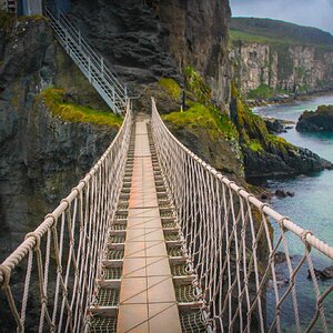
6 [3/6/10] i love how this turned out.

7 [3/8/10] I don't have exposure times for #7-9 b/c these were already submitted before I got all the great suggestions in my thread.

8

9

Keep checking back because I will update my 1st post with pics of finished prints. Thanks for looking!
Oh, and I have to take pics of my prints because I don't have a scanner. =/ I know, I know.. ghetto. LOL. I tried my best to keep the pics exactly the same as my prints.. so excuse the double picture effects which turn out flat. I'll get around to using the scanner at school once I get the chance. Sorry.
Camera: Nikon FE 35mm slr
Film: Ilford HP5 plus 400 b&w
Paper: Ilford multigrade FB
C&C is always welcome!
1 3 separate prints here
2
3
4
5 i really like this one.
6 [3/6/10] i love how this turned out.
7 [3/8/10] I don't have exposure times for #7-9 b/c these were already submitted before I got all the great suggestions in my thread.
8
9
Keep checking back because I will update my 1st post with pics of finished prints. Thanks for looking!
Last edited:
")


![[No title]](/data/xfmg/thumbnail/36/36302-6ee4929dfdf80290ffd73704693e860f.jpg?1619737496)
![[No title]](/data/xfmg/thumbnail/39/39290-dfb3e819bd94a7f30797638ae1ae27cf.jpg?1619738958)