My antique pickup

emptypockets

TPF Noob!
Joined
Mar 26, 2008
Messages
197
Reaction score
0
Can others edit my Photos
Photos OK to edit
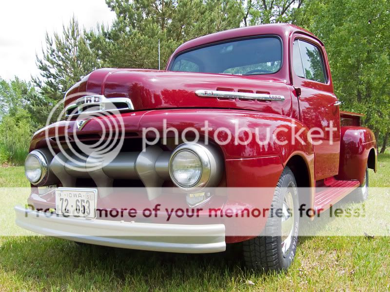
This pickup has been in my family since 1952 and my grandfather gave it to me when I was 8. We've finally gotten around to restoring it and taking some snaps. Let me know which is your favorite!

1.
oldpickup10.jpg


2.
oldpickup2.jpg


3.
oldpickup3.jpg


4.
oldpickup9.jpg


5.
oldpickup8.jpg
 
Nice, classic pickup!

my fav is no.4, if you did it in HDR, you would got the right exposure for the background ( the sky )
 
Cool pickup, #2 is my favourite, really diggin the angle, makes it look like a monster that wants to kill me. Shame about the overexposed sky though.
 
#1.

Old pickup and an old bridge go together nicely. Fewer reflections on the metal and windshield. Now, get rid of the light pole.
 
Nice, classic pickup!

my fav is no.4, if you did it in HDR, you would got the right exposure for the background ( the sky )

Glad everyone likes the subject! It was a labor of love and mucho dinero for sure! Here's the shot with a little more PP done. I'm tweaking the first and will post it soon. Thanks again for all the comments.

oldpickup12.jpg
 
I hope you don't mind but I removed the light pole from the first picture like a couple people suggested. I was bored and wanted to give it a try. Hope you like it. Beautiful truck by the way! I'm a Ford man too!
Untitled-jnikjn.jpg
 
Much nicer without the light pole. And if you're still bored, go ahead and get rid of the building on the left:lol:
 
Since the consensus seems to be pic #1, I did more pp on this one too, cloned out the light pole, added some contrast and upped the color hues to make things pop.

oldpickup13.jpg
 
The building in the background was quite distracting, as was the bright orange road sign. So, I cloned them both out in this picture. I also created a duplicate layer and added some gaussian blur to the background and set the opacity to 80%. Below is the result and let me know what you think.

oldpickup14.jpg
 
to me the blur is distracting, but much nicer without the building. nice truck!
 
I dont like the blur edit but somehow you've managed to get a sort of tilt shift miniature effect. Unless you're trying to go for that I'd say start again, but cool either way.
 
That's a really cool truck and top dollar resto too....for reflections and objects poking out are a problem in all them to some degree. Find a plain background with a wide open area behind you, that will compliment the truck best I think. Something like an old warehouse.....or gravel pits work really well and that deep maroon paint would look great.
 
Yep, the blur doesn't seem to fit. Photo seems to be a bit narrow. Wider background perhaps? But one nice Ford you got there!
 
The building in the background was quite distracting, as was the bright orange road sign. So, I cloned them both out in this picture. I also created a duplicate layer and added some gaussian blur to the background and set the opacity to 80%. Below is the result and let me know what you think.

oldpickup14.jpg

Much better without the building on the left and the orange thing. But the blur does bother me. Blurry trees wouldn't but the blurry bridge just does not look right.
 

Most reactions

New Topics

Back
Top