My fave man

Joined
Mar 26, 2008
Messages
1,270
Reaction score
0
Location
Haverhill, Ma
Can others edit my Photos
Photos NOT OK to edit
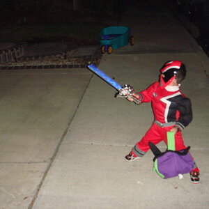
My son! We had memorial day with just me and him. Lots of HHCC welcome. I haven't shot him in quite a while now... I felt like I had lost my ability, actually after shooting so many other children. So I am glad we re-connected today.:hug::

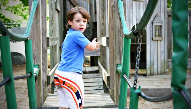
He finally figured out how to swing on this thing for the first time today
1.
IMG_1985.jpg

2.
IMG_1996.jpg


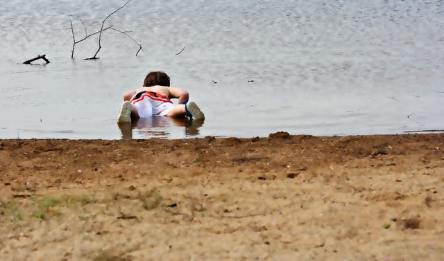
water? hmm how's it taste?
3.
IMG_2011.jpg


fun to jump!
4.
IMG_2017bw.jpg


and kick!
5.
IMG_2018.jpg


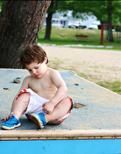
drying off and chillin
6.
IMG_2058.jpg


7.
IMG_2055.jpg


My 2 faves of the day.
8.
IMG_2051.jpg


I know this is centered... but I like how if you stare at it long enough, he looks like he's held up by strings :)
9.
IMG_2070.jpg
 
My favs are actually 6 and 9. :) The strings thing is funny! It really does kinda give you that feeling....and I even get a greater sense of DOF though he's right at the dock/platform he's jumping off of...

they're all really, really nice if you ask me.

# 4 is a great shot too? love to see that in color maybe.

thanks for posting them. I love seeing everyone's photos and the ones of their kids are always some of the best!!!
 
I like these, especially 3 & 4.
No face, but they're unique.
 
#1: Good shot. A little too much contrast.
#2: Great. Check the highlights on the shorts.
#3: Nice, but very weird effect/bokeh.
#4: I'm undecided. There's really a lot of blur, and I'd much prefer it from the front.
#5: Not a keeper in my book.
#6: Probably the best. Check the highlight on his chest, drop the contrast, bring out more detail in the hair.
#7: A pretty good all-around shot.
#8: I know you love it but it's not a keeper for me. He looks too concerned, and the highlights are too pronounced.
#9: Good shot but poor shadow detail and you need to check the highlights on the shorts again. Could use a re-work in post.

Thank you :thumbup:
The weird bokah was a surface blur.. I used it on 3 and 4. They are actually quite sharp SOOC. :)

Those white shorts!!!! I did seem to blow them out a lot. And then moreso in PP. Since these shots were just for fun, I don't really care to fix them, but I was definilty aware of it while shooting and will be really careful on a client shoot for something like that. It does ruin the shot in the end.
 

Most reactions

New Topics

Back
Top