My favorite model - Re-Edit - Sepia

frog21

TPF Noob!
Joined
Dec 4, 2012
Messages
19
Reaction score
5
Location
Virginia, USA
Can others edit my Photos
Photos OK to edit
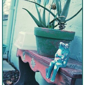
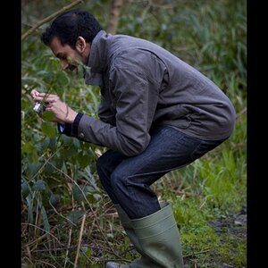
I shot this pic a year ago and I have been doing some re-edits since I am more comfortable in Lightroom. Please comment and critique.
BethanySepiaWeb.jpg
 
Sorry, just not a fan of sepia-esque processing, especially for portraits. If she had been wearing 19th century clothing it might work, but...
 
Her face is seemingly textureless and this photo suffers from it.
I did go a little to far with editing her face. I was trying for a very soft almost porcelain like skin effect. However, the model really likes this one.
 
Thanks for the comment but I disagree. I think your re-edit looks harsh and very unflattering. I was aiming for a soft pleasing look. The reason for the vignette was to focus more attention on the face of the model.
 
Thanks for the comment but I disagree. I think your re-edit looks harsh and very unflattering. I was aiming for a soft pleasing look. The reason for the vignette was to focus more attention on the face of the model.

what he said.


p!nK
 
At first I thought my monitor needed to be re-calibrated, then I saw the edit further down. Don't get me wrong I'm a fan of Sepia, as well as vignettes, but tone of your image is distracting, almost a greenish yellow. I like the softness of the face, combined with the sharpness of the eyes. It almost looks like your going for a High Key approach. Only my opinion, but I think you could improve the image by changing the tone slightly while still maintaining the look.
 
Thanks for your advice on the tone. I just looked at this post on 2 of my monitors and on one it does have the slightest green cast but not on my main monitor. I think i need to check calibration. You are right about the "almost High Key approach".
 
I don't normally edit someone else's photo, because I'm still learning myself, but the image you have is really good, it just needs a little more. When I downloaded a copy of your image it appeared that the white balance was off slightly. I did a color balance, curve adjustment, used a luminosity mask (thanks to Tim Tucker for explaining this to me) to brighten the image and highlights, and applied a blue filter to enhance the High Key look. I'm sure there are others more qualified than I that can improve it even more. As we all know opinions are like noses every one has one! LOL

BethanySepiaWeb 1.jpg
 
I don't normally edit someone else's photo, because I'm still learning myself, but the image you have is really good, it just needs a little more. When I downloaded a copy of your image it appeared that the white balance was off slightly. I did a color balance, curve adjustment, used a luminosity mask (thanks to Tim Tucker for explaining this to me) to brighten the image and highlights, and applied a blue filter to enhance the High Key look. I'm sure there are others more qualified than I that can improve it even more. As we all know opinions are like noses every one has one! LOL

View attachment 127535
Thanks, I like your edit. The color balance curve adjustment is something even I can handle but the luminosity mask is beyond my meager Photoshop skills.
 
unfortunately, in both sepia edits, the highlights are so hot on her face it kills all detail.
the sepia treatment just makes her look jaundiced.
in my opinion, this one warrants a reshoot with better controlled lighting.
subject is too pretty not to.
 
I'll throw in my 0.02 cents.
I like the Sepia image but up to a point.
I think the face is a bit overdone and her face looks a little ghostly. ie, Although I like the softness it just seems a bit bright. But I love the sharp eyes which seems to get emphasized more due to the brightness & softness of her face.

though the photog has the artistic license here of how far to go.
Most people love photos of themselves or other people they know irrelevant of any extreme's in processing or weird instagram stuff. So if the client is happy, that's all that matters.
 
Can only go by this laptop but the first one looks like a coating of white over the face and the second looks like a rough textured skin was patted with pancake makeup. Neither looks natural or real.
It's really hard to do "High Fashion" skin without special purpose software.....
 
t the luminosity mask is beyond my meager Photoshop skills.

I would suggest you read this thread by Tim Tucker. He explains things in way that's easy to understand. Been a while.

As to the other comments about the OP's choice of look, processing, etc., it really shouldn't be an issue. While some don't like the High Key look, or Sepia, it was his vision. The helpful thing would be to make suggestions on how he can improve the image (in his vision), rather than criticize his direction, unless his choice was so far off base that there was no improvement possible. Learning is a process of experimenting with techniques. There are some people far more talented than I on here that hopefully will step in to help the OP.
 

Most reactions

New Topics

Back
Top