
kreuzberg
TPF Noob!
- Joined
- May 28, 2009
- Messages
- 79
- Reaction score
- 0
- Can others edit my Photos
- Photos OK to edit
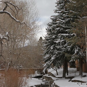
I've just recently got into photography and I thought I'd just post a few of my pics to see what you guys think, and if you've got any tips
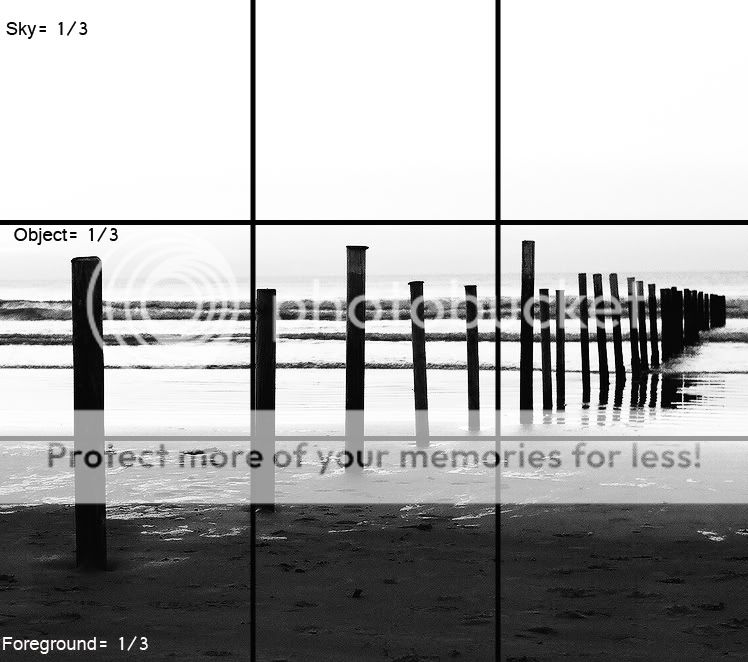
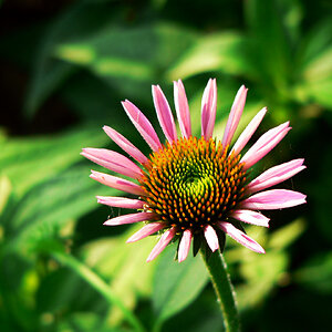
1.

2.

3.

4.

5.

6.

All of them are unedited, apart from the last one which I cropped a little so any post processing suggestions are also welcome!
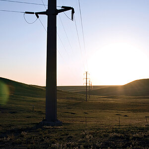
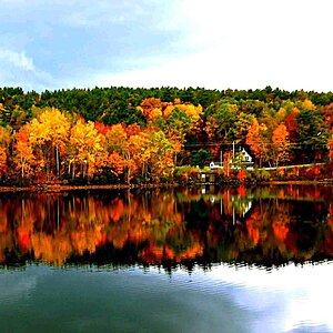
1.
2.
3.
4.
5.
6.
All of them are unedited, apart from the last one which I cropped a little so any post processing suggestions are also welcome!
Last edited:
") .
.

![[No title]](/data/xfmg/thumbnail/36/36650-edd8c21212fe9fbd7e59bfb08cdc91ea.jpg?1619737672)
![[No title]](/data/xfmg/thumbnail/37/37126-93feffeca0e9e6ad893962c03a7a341e.jpg?1619737884)
![[No title]](/data/xfmg/thumbnail/32/32716-bd7f0a0030263f160d995f8547043458.jpg?1619735621)
![[No title]](/data/xfmg/thumbnail/41/41800-9fad93555f178073cae2f303c5ef4e23.jpg?1619739897)

![[No title]](/data/xfmg/thumbnail/32/32719-7d42e7d7077540fabb3fa0275a99899a.jpg?1619735625)
![[No title]](/data/xfmg/thumbnail/32/32718-19d5f7764b6f43f6cec5a67701261560.jpg?1619735624)