kundalini
Been spending a lot of time on here!
- Joined
- Jul 18, 2007
- Messages
- 13,607
- Reaction score
- 1,937
- Location
- State of Confusion
- Can others edit my Photos
- Photos NOT OK to edit
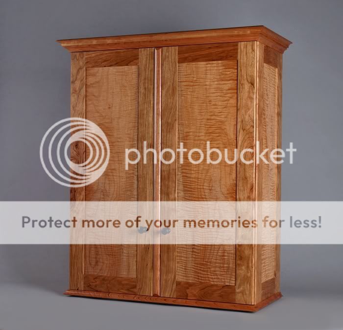
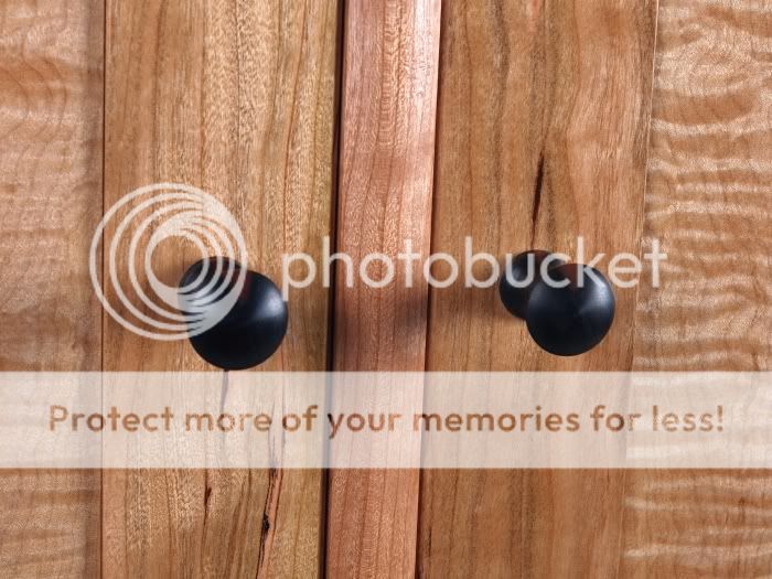
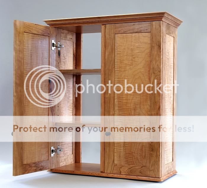
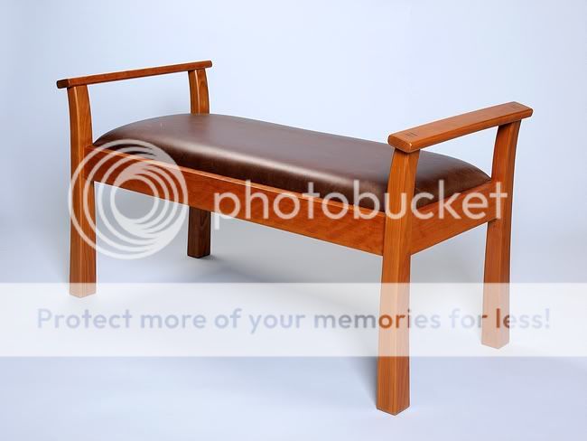
Awesome craftmanship on the furniture Don. I'm guessing you're a 'no hardware' kinda guy with joints and fasteners. I used to dabble with smaller stuff like jewelry boxes.
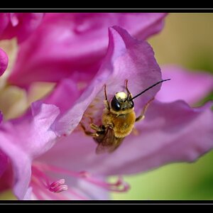
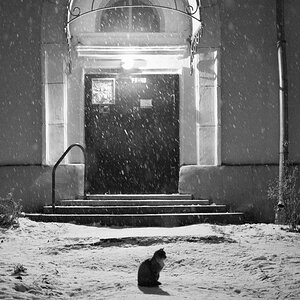
I like the photos and see what you mean about the end use of the shot with regard to background and shadow. There is some background blowout that is causing the wash of color, particularly with #2 & 3. Otherwise, nice work.
I like the photos and see what you mean about the end use of the shot with regard to background and shadow. There is some background blowout that is causing the wash of color, particularly with #2 & 3. Otherwise, nice work.
")


![[No title]](/data/xfmg/thumbnail/39/39444-02925f6d2859f4fda0e89f2001bfc9cd.jpg?1619739034)

![[No title]](/data/xfmg/thumbnail/36/36303-10b1a386a9a00cf90fb7605d2d2c48c1.jpg?1619737497)
![[No title]](/data/xfmg/thumbnail/39/39447-6e7679723d775935851f055bae9712ba.jpg?1619739036)


![[No title]](/data/xfmg/thumbnail/30/30991-43abf4dfee0a54010692c71c43f40981.jpg?1619734555)