
Dcrymes84
TPF Noob!
- Joined
- Mar 28, 2009
- Messages
- 446
- Reaction score
- 0
- Location
- Greenville, South carolina
- Can others edit my Photos
- Photos NOT OK to edit
Photo #1

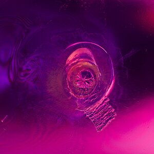
Photo #2
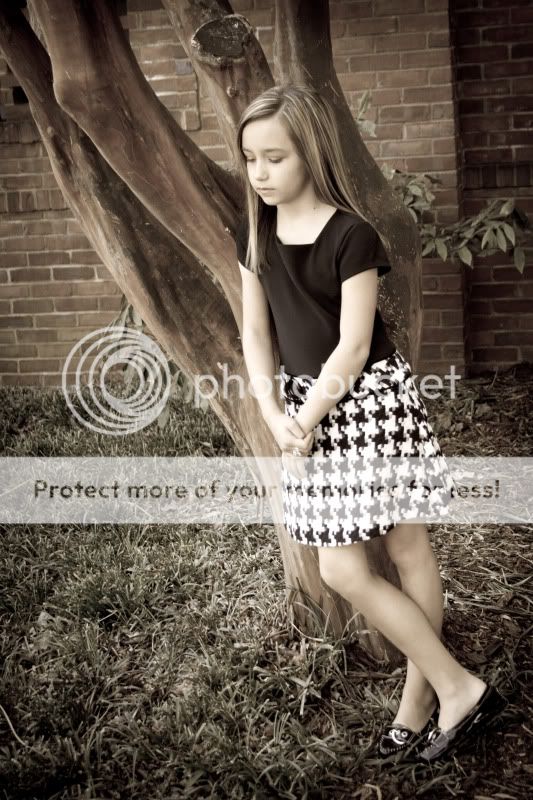
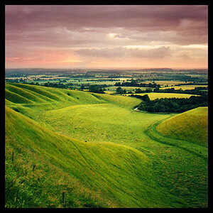
Photo #3
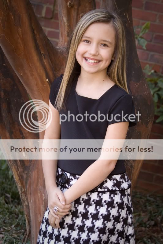
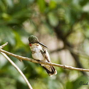
Photo #4
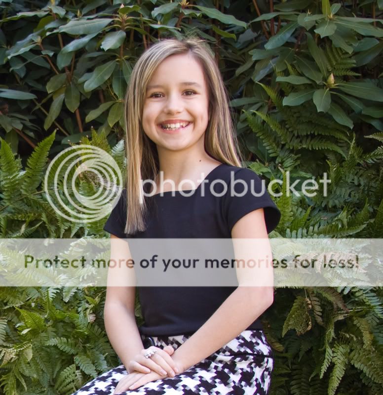
Photo #5
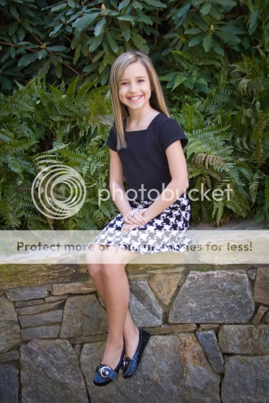
Photo #5

Photo #6
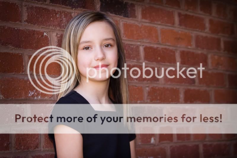
Photo #2
Photo #3
Photo #4
Photo #5
Photo #5
Photo #6
") :mrgreen:
:mrgreen:![[No title]](/data/xfmg/thumbnail/41/41902-e45a2db116295062060b22cde75818ed.jpg?1619739939)
![[No title]](/data/xfmg/thumbnail/40/40287-4f839095000f74d779b90ed75df9dc62.jpg?1619739408)
![[No title]](/data/xfmg/thumbnail/40/40284-f59f6230f0d5b9eacf977f8b0392f087.jpg?1619739407)
![[No title]](/data/xfmg/thumbnail/40/40288-4d5d7a8aa74ddfceb5fb82062d9b21be.jpg?1619739409)


![[No title]](/data/xfmg/thumbnail/38/38265-4b75e7e05f8bf906800580ac7f7ddf60.jpg?1619738549)
