Hi Wildbill,
As the site loaded, I was thinking, 'looks promising' but the logo, once it appeared, murdered the overall impression! I'd lose the logo, and, if you were to make the main table area scaleable, rather than fixed, it would centre the images within the window, rather than, as I've just seen, place the image over to the right hand side.
I'm looking at the site with a 12" Powerbook and as such, the logo appears as 'WILDBILLSPHO' and the rest I need to scroll horizontally to see. Like many, I spend a lot of my time on much higher res screens, but when travelling, I expect a site to fit a laptop screen - with a few tweaks to the code, and removing the logo, you'd be far more universally browseable.
I never thought to look at it with a 600x800dpi screen, My main monitor is set at 1280x1024dpi.
I resized the logo while using the small monitor till there was no scroll bar at the bottom.
As far as making the main table area scalable, I wish I knew how, I tried some different scripts nothing seemed to work, and I am not that good that I can wright one my self. So any help would be greatly appreciated!
It's looking way better on a 1024 x 768 screen already - with the logo smaller, the focus is now on the photographs.
I had a load of help from my web-designing-co-directors with my site (they built the template and I populated it with the text and imagery) and so I can't offer you html specifics I'm afraid, but I'm seriously impressed at the speed at which you take feedback on board!
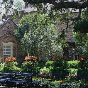
As stated, much better with the smaller title! I find the navigation on your site very easy both for looking at images and finding ones way around and the slideshow on the main page is also great just to get a taste of your photos before looking at the galleries.
The only part of your site which I am not entirely fond of it is the golden yellow 'sections' at the top and bottom. Some photos this natural 'border' compliments very well, but in others it doesn't do the iamges any justice. Now after saying that, I should mention I have no experience with art or web design.
Thats what I thought too but two different spell checks both said this way (MS Outlook and ispell)
Now this one here says this way "Gallery's". Go figure
Bill


![[No title]](/data/xfmg/thumbnail/42/42230-fa8ace50a80342c7d91db1431f911bab.jpg?1619740048)