OP
OP
JeffieLove
No longer a newbie, moving up!
- Joined
- Feb 8, 2010
- Messages
- 1,601
- Reaction score
- 15
- Location
- Elkton, MD
- Can others edit my Photos
- Photos OK to edit
thanks bazooka ") You definitely didn't come of as a jerk
You definitely didn't come of as a jerk
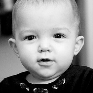
my only issue with that picture as it stands right now is all the little squiggly looking things in the background... they showed up when I played with the saturation and I am not good enough at PP yet to get rid of them :/ lol
So, I will get rid of the (C) thing, and shrink the font size... Then we should be good...
Right now, the (C) is in 18pt font size
You definitely didn't come of as a jerk my only issue with that picture as it stands right now is all the little squiggly looking things in the background... they showed up when I played with the saturation and I am not good enough at PP yet to get rid of them :/ lol
So, I will get rid of the (C) thing, and shrink the font size... Then we should be good...
Right now, the (C) is in 18pt font size


![[No title]](/data/xfmg/thumbnail/37/37489-27b092c23ed6ad63eee4cd03f96a311a.jpg?1619738111)